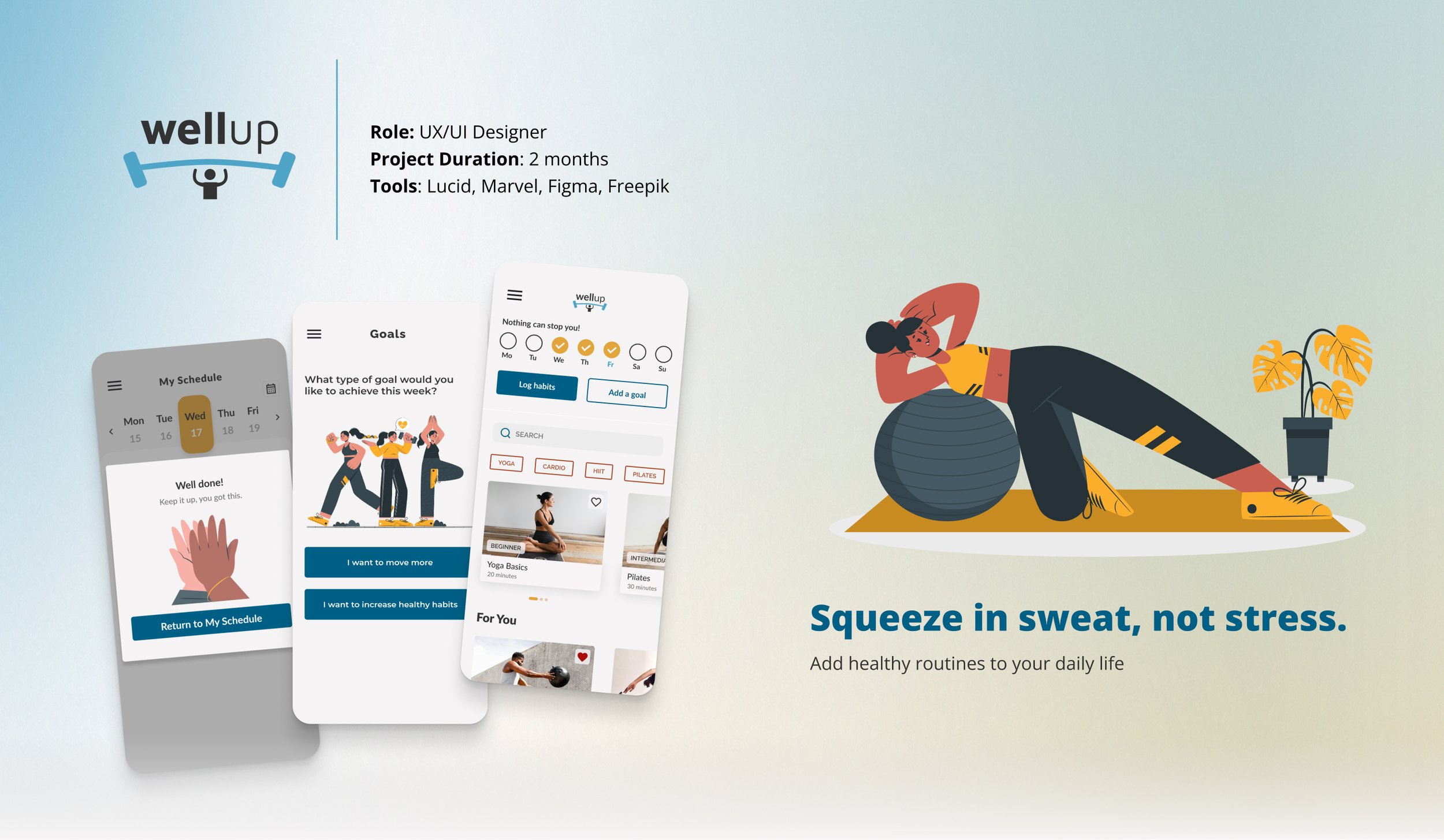
Overview
WellUp is a responsive web application designed to help people, especially those new or returning to fitness, build exercise routines that actually fit into their lives. The core design challenge wasn’t finding the right features. It was figuring out how to make consistency feel achievable rather than overwhelming for someone who’s already tried and stopped before.
The Problem
Many individuals, especially those new to or returning to fitness, struggle to incorporate personalized exercise routines into their busy daily schedules.
The challenge wasn’t motivation. Most people want to exercise. It was that existing tools assumed users already knew how to build a routine. WellUp was designed for the gap between wanting to start and knowing how.
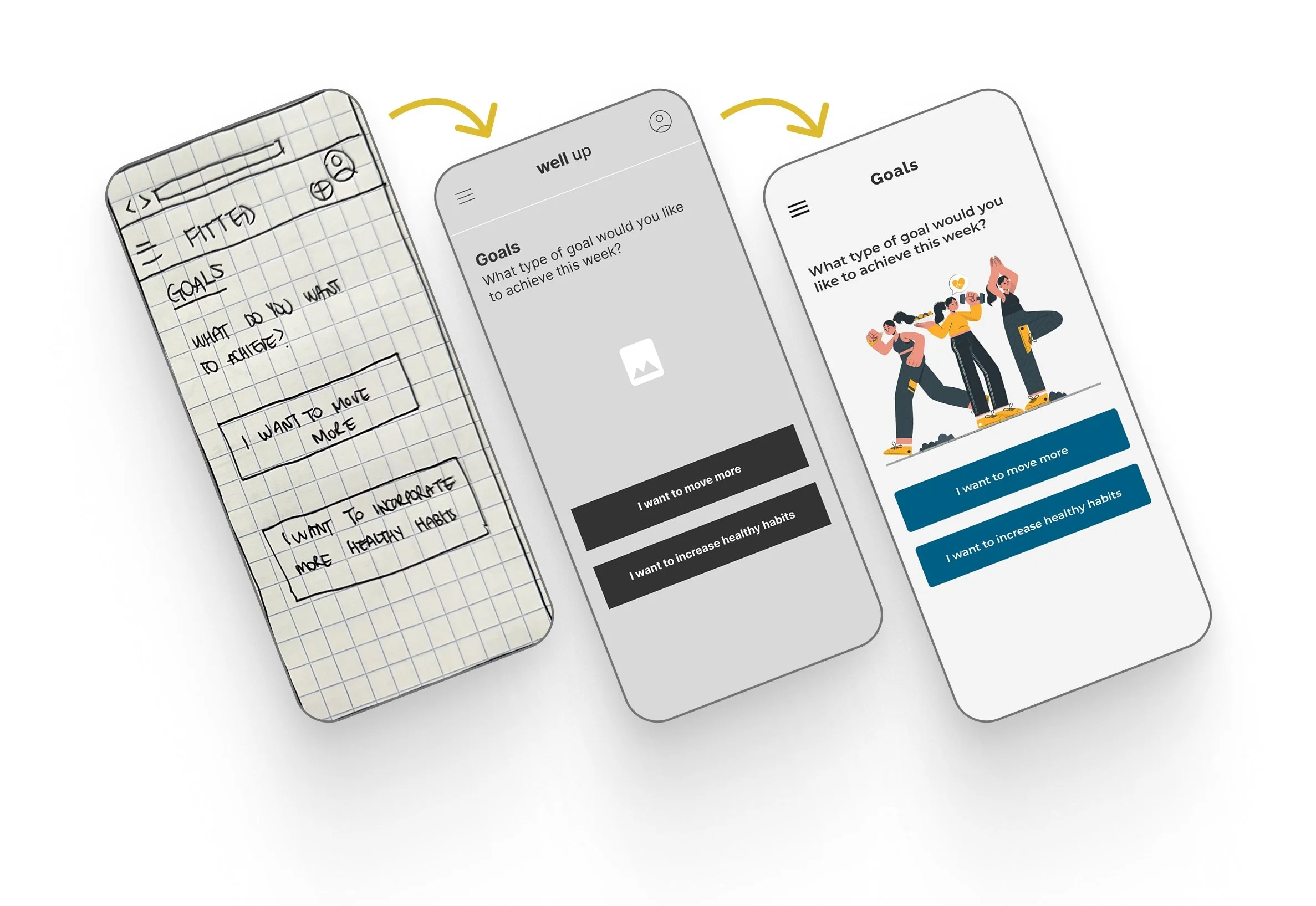
Goals
Create a responsive web application that will:
Help people plan an exercise routine that suits their level, schedule, and interests.
Allow users to search and view routines, guides, daily challenges, and other information on any device and integrate these with their personal calendar.
The Process
User Persona
Rebecca’s profile surfaced a tension that became central to the design: she had the motivation but not the structure. Every major decision in WellUp was pressure-tested against that gap.
I continually referred back to it to inform my decision-making throughout the design process, ensuring that each element of the interface was purposeful and aligned with the goals and motivations of our potential users, like Rebecca.
User Stories
User Flows
Mapping the flows before wireframing surfaced an early decision: four distinct task types all needed to coexist from a single home screen.
Getting the architecture right at this stage meant the wireframes had clear guardrails and avoided the feature-collision problem that makes most fitness apps feel overwhelming to new users.
Mobile-First Forced the Right Prioritization Decisions
Designing with a mobile-first approach laid a solid groundwork for scaling up to larger breakpoints effectively.
By establishing a strong foundation at this initial stage, I was better equipped for a smooth transition across different screen sizes, maintaining consistency and coherence throughout the user journey.
What User Testing Revealed
In testing with 2 participants using a low-fidelity prototype with Marvel, both users stalled at the same point: the relationship between the search function and the “Discover more” button wasn’t clear.
This wasn’t a small UX detail: it blocked the primary task flow within the first two minutes of testing for both participants.
What Changed and Why
With the feedback, a revised prototype was created on Figma.
What Changed?
The "Discover more" button was removed from the design. After considering the task flow of the “Discover more” button, I determined it could be streamlined with the search function.
Buttons and calls to action have been made more distinguishable with the use of contrasting colors.
Searching Exercises & Filtering Results
Visual Direction
Mood Boards & Style Guide
Partial branding guidelines were already provided, which gave the visual exploration a starting point without constraining it entirely.
I moved forward with the illustration-based direction (second board) for a specific reason: the target user wasn’t someone who needed more fitness motivation. They needed an environment that didn’t make them feel behind. Illustrations over photography made the app feel less like a performance standard and more like a place worth coming back to.
Accessibility
Hitting WCAG contrast standards while keeping the palette feeling energetic (not clinical) was harder than expected.
The first direction failed AA compliance at 2.55:1. Rather than defaulting to safe neutrals, I iterated until reaching 5.37:1 while preserving the motivational tone. Every new iteration was audited before moving forward.
Designing for Different Breakpoints
Mobile: The hamburger menu wasn’t a default, it was a deliberate trade-off. Keeping navigation collapsed prioritized the exercise card grid, which was the primary reason users opened the app in the first place.
Tablet: The additional real estate allowed a shift from single-column to grid layout, reducing the horizontal scrolling that testing had flagged as a friction point on mobile.
Desktop: Navigation moved to a persistent top bar because desktop users were more likely to be in a planning mindset than an in-workout mindset. More statistics and progress detail made sense at this context.
Hi-fi Designs: Features
🎯 Goal Setting
Offering two goal types — movement and habits — came from a research insight that users who had previously abandoned fitness apps often felt they’d “failed” because their only metric was exercise frequency. Broadening the definition of success was a deliberate design choice, not a feature addition.
📅 Planning an Exercise Routine
Scheduling was designed to turn intention into commitment.
Choosing a specific date, time, and reminder frequency removes the ambiguity that research identified as the most common reason users abandoned their routines before they started.
💪 Encouraging Progress
The language in the reschedule prompt — “Missing a session Let’s reschedule for success!” — was written to avoid shame language.
Testing showed users responded better to treating a missed session as a planning opportunity than to motivational pressure, which can quietly reinforce the feeling of failure it’s trying to prevent.
Reflections
Aligning Visual Direction with Functionality
Working from a mood board alone wasn’t enough to catch conflicts between visual direction and functional requirements early.
I made more UI adjustments mid-process than I should have needed to, which taught me that aligning on visual direction and planned features at the same time isnt a nice-to-have, it’s how you avoid expensive rework.
Mobile-First Requires Ruthless Prioritization
Mobile-first sounds like a constraint but it’s actually a clarity tool.
Being forced to decide what mattered most on the smallest screen made every subsequent breakpoint easier to design. The ruthless prioritization mobile requires should probably happen on every project regardless of primary platform.
Future Direction
The next meaningful test would be longitudinal.
Does the scheduling and reminder system actually change behavior over 2-4 weeks, or does engagement drop after the novelty wears off?
That’s the question the current prototype can’t answer yet.