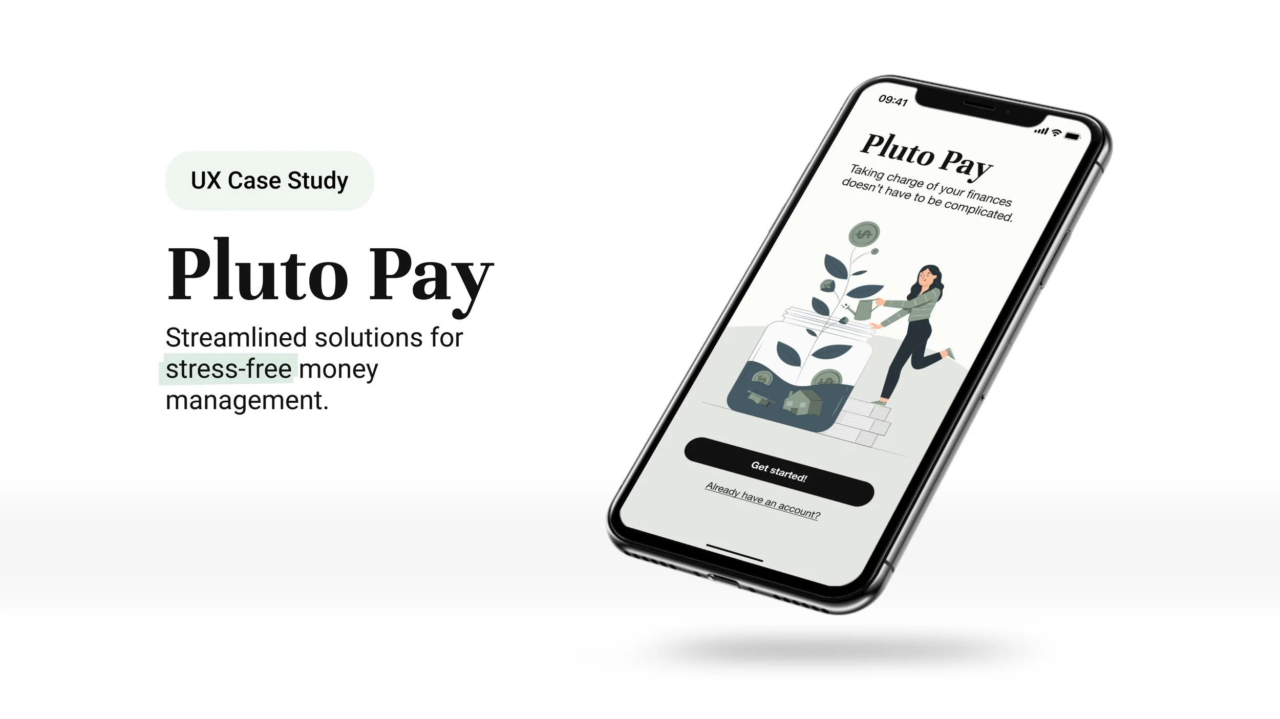
Overview
Pluto Pay is a personal finance web application built around a single conviction: most money management tools fail not because of missing features, but because of too many.
Guided by Hick’s Law and Miller’s Law, the design prioritizes reducing cognitive load. Simplifying choices, surfacing what matters, and making financial management feel approachable.
The target user isn’t a financial expert. It’s someone who knows they should be managing their money better and keeps getting overwhelmed trying.
Role
Sole UX/UI Designer and Researcher
Timeline
June — December 2023
More Apps, Same Problem
The fintech landscape has grown rapidly, giving rise to a wide range of money management applications.
The problem certainly wasn’t a lack of tools. Mint had millions of users at the time of this research, and people were still overwhelmed. The opportunity wasn’t to build another feature-rich dashboard. It was to design something that made users feel capable rather than behind.
What Already Existed, and Where It Failed
Competitive Analysis
Mint and NerdWallet represented opposite ends of the spectrum — one automation-heavy, one information-heavy — and neither had solved the core usability problem research would later confirm: users didn’t feel guided, they felt managed.
What Real Users Said
With competitive gaps identified, I needed to validate assumptions with real users.
A survey of nine individuals followed by one-on-one interviews with three participants surfaced a consistent pattern: the problem wasn’t motivation or access, it was feeling overwhelmed and unsupported. Over half of survey respondents cited feeling overwhelmed as their primary reason for seeking help with finances. Nobody said they didn’t need help.
Three Things Every Participant Said
Organizing interview data with affinity mapping
Complexity is the product failure, not the user failure
Users weren’t avoiding finance apps because they lacked discipline. They were avoiding them because the apps made them feel incompetent. The setup process alone was enough to trigger abandonment.
Free tools are leaving the most useful feature on the table
Every participant wanted spending broken down by category. Almost no free tools offer this meaningfully. That gap became a core design priority for Pluto Pay.
Helplessness, not complexity, causes abandonment
Users didn’t leave finance apps because they were too complicated. They left because when something went wrong financially, the app offered little to no path forward. Guidance at moments of failure became a non-negotiable feature requirement.
Who This Was Really Design For
Research revealed two distinct user types with different financial situations but the same core problems: feeling behind and unsupported.
Annie and Cody represent opposite ends of the income and life-stage spectrum. Every major design decision in Pluto Pay was tested against both.
Ideation
Mapping the Architecture Before the Screens
Two user flows governed most of the early architecture decisions: creating a plan and adding a goal.
Mapping these separately revealed an immediate tension — users intuitively wanted to add a goal before creating a plan, which was the opposite of the intended sequence. That conflict became Issue #1 in usability testing and drove one of the most significant structural changes to the design.
Low- to Mid-fidelity Wireframes
The wireframing process surfaced the central design tension immediately: every feature research had identified as necessary added a decision point, and decision points were exactly what the target user was trying to escape.
Each design choice was weighed against the same question: does this reduce or add to the cognitive load the user is already carrying?
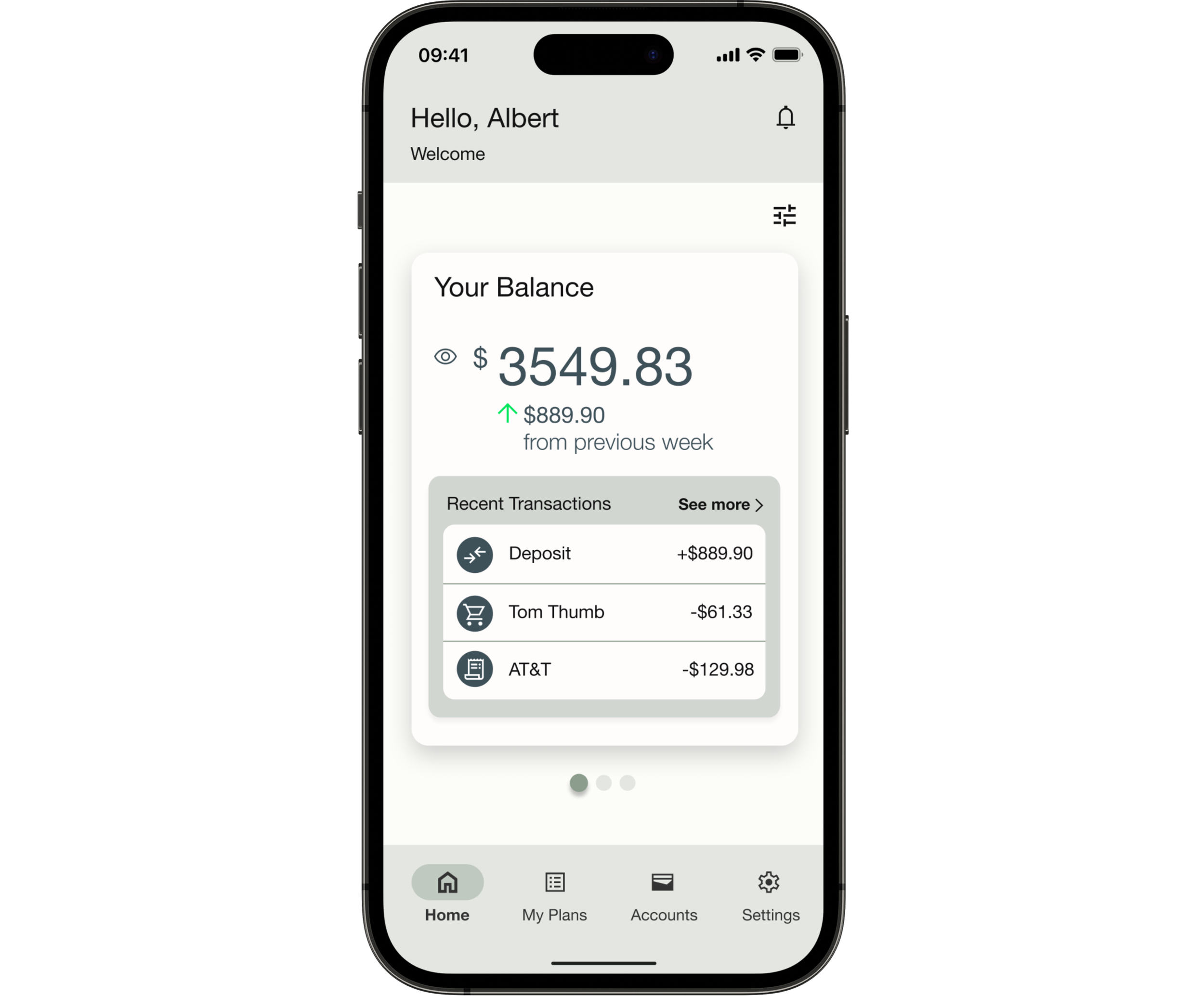
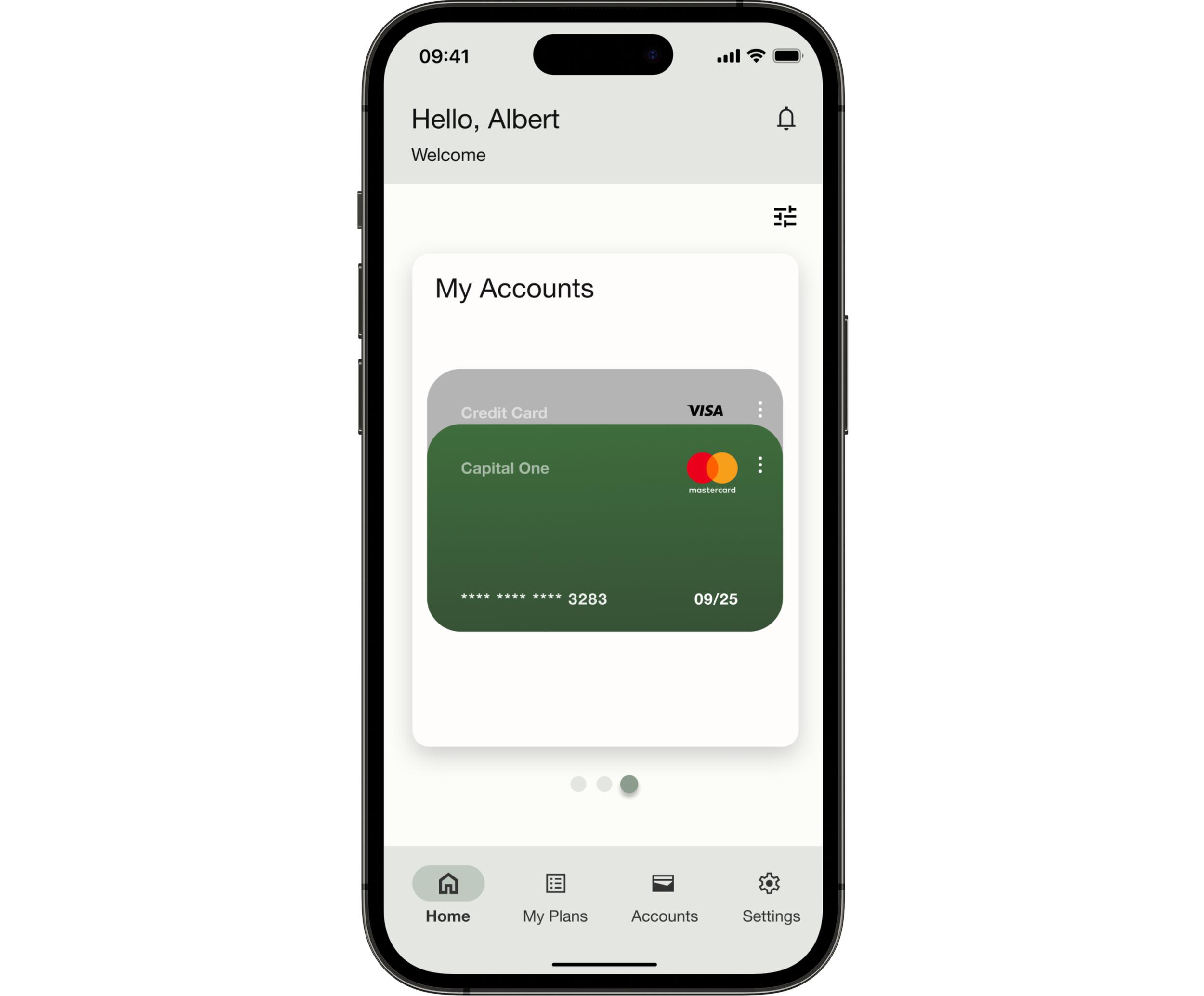
Feature: Add a Plan (mobile)
Sign-up & onboarding
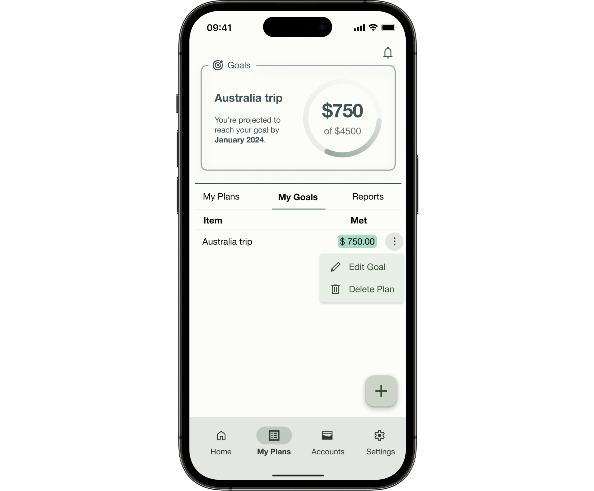
“My Plans” page onboarding: adding Plans & Items
Testing the Design
Usability testing with 6 participants — all within the 25-45 target age range, all with prior experience using money management tools — was conducted across moderated in-person and remote sessions.
The goal was to test three questions:
were the flows intuitive?
was the app learnable?
where did navigation break down around the core tasks of creating a plan and setting a goal?
What Testing Revealed
Six tests completed. All participants successfully completed all tasks. Average difficulty score: 1.6 out of 5.
But the aggregate number masks where the real friction lived: four distinct issues emerged, ranging in severity from high to low.
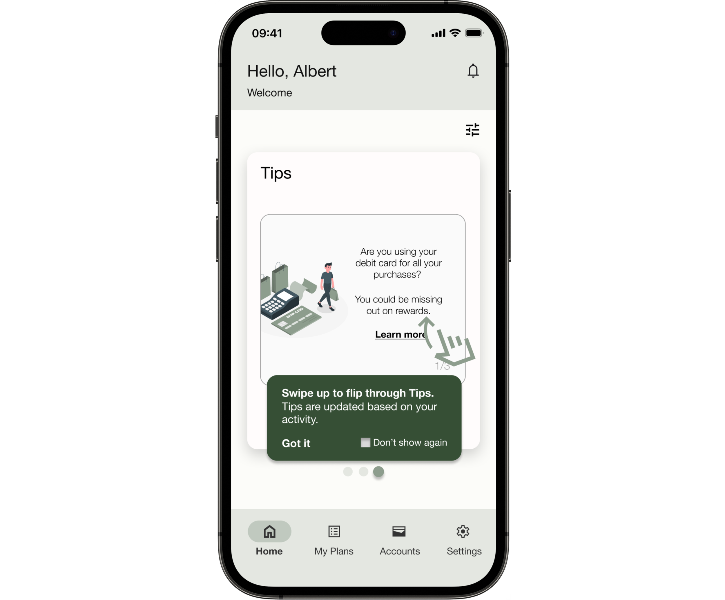
One important aspect of testing the prototype was to make sure the onboarding was clear and helpful.
The feedback wasn’t perfect, but it confirmed that the tool tip design of onboarding was the right choice. By the end of the testing, I learned I needed to work on improving how the users would navigate around the tool tip.
Affinity mapping and rainbow spreadsheets were methods used to organize the findings from the usability test.
What Testing Changed
Simplicity without clarity is just a different kind of confusion
Participants appreciated having the complexity of managing money simplified but oversimplification lead to confusion at certain points during navigation.
The flows missed the order users actually think in
When creating task flows, it’s important to take more time to consider all the possibilities and edge cases to avoid road blocks.
Tool tips: Users liked the concept. The execution needed work.
Although there was confusion about how to navigate from the onboarding tool tips, by the end of the test session, all participants stated they preferred this type of onboarding when learning how to use a new app.
Polishing the Design
Iterations & Revisions to Improve Accessibility
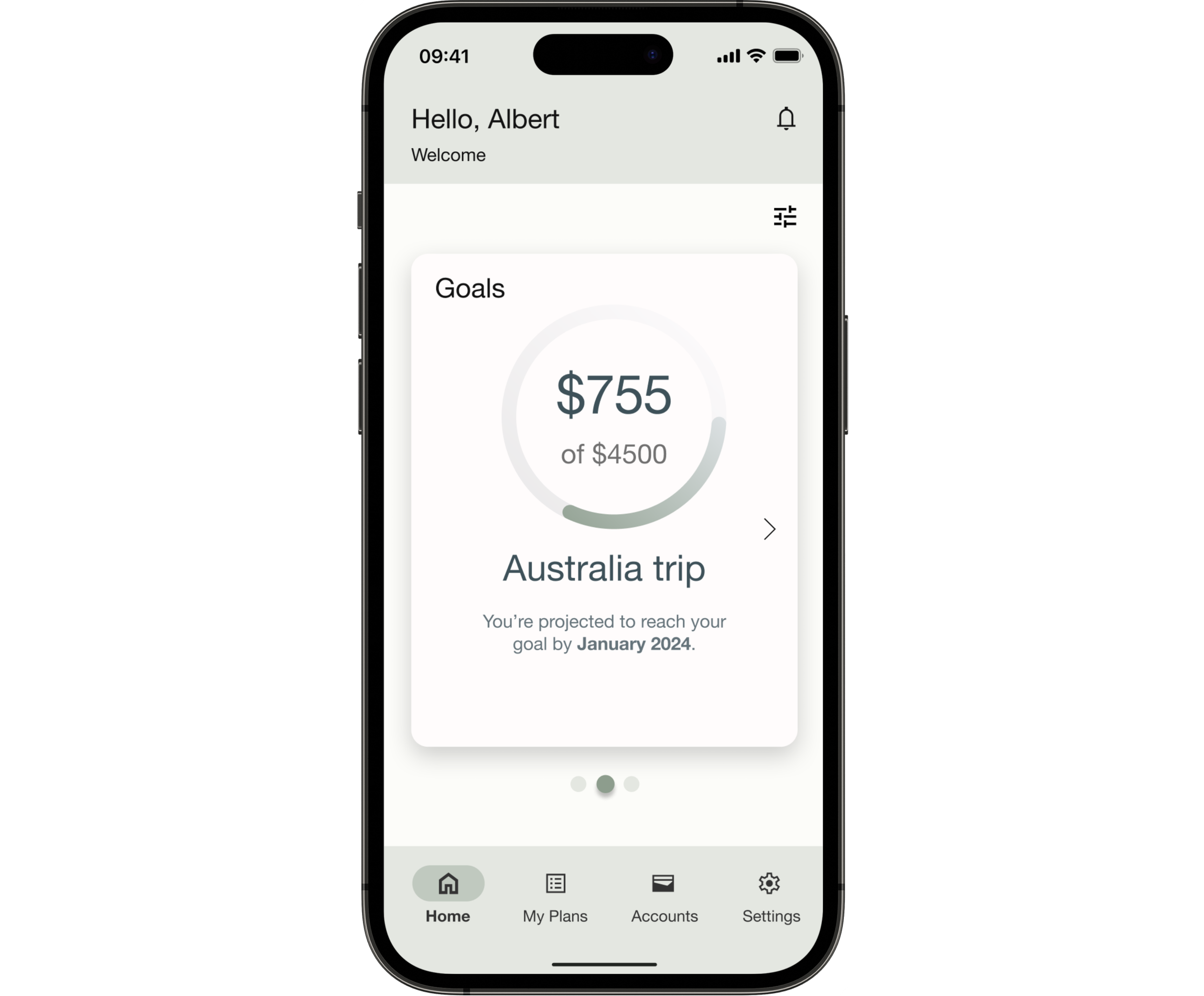
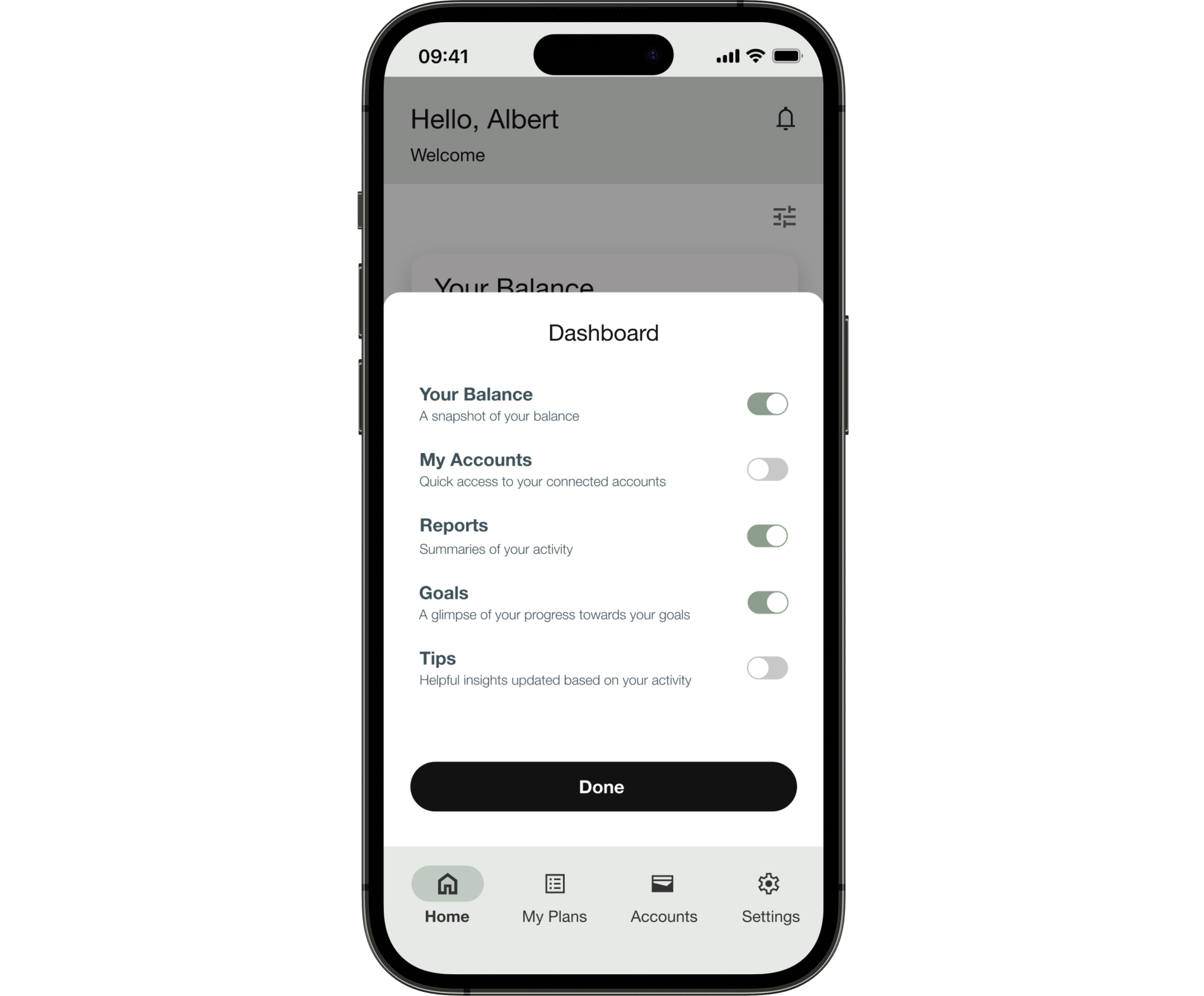
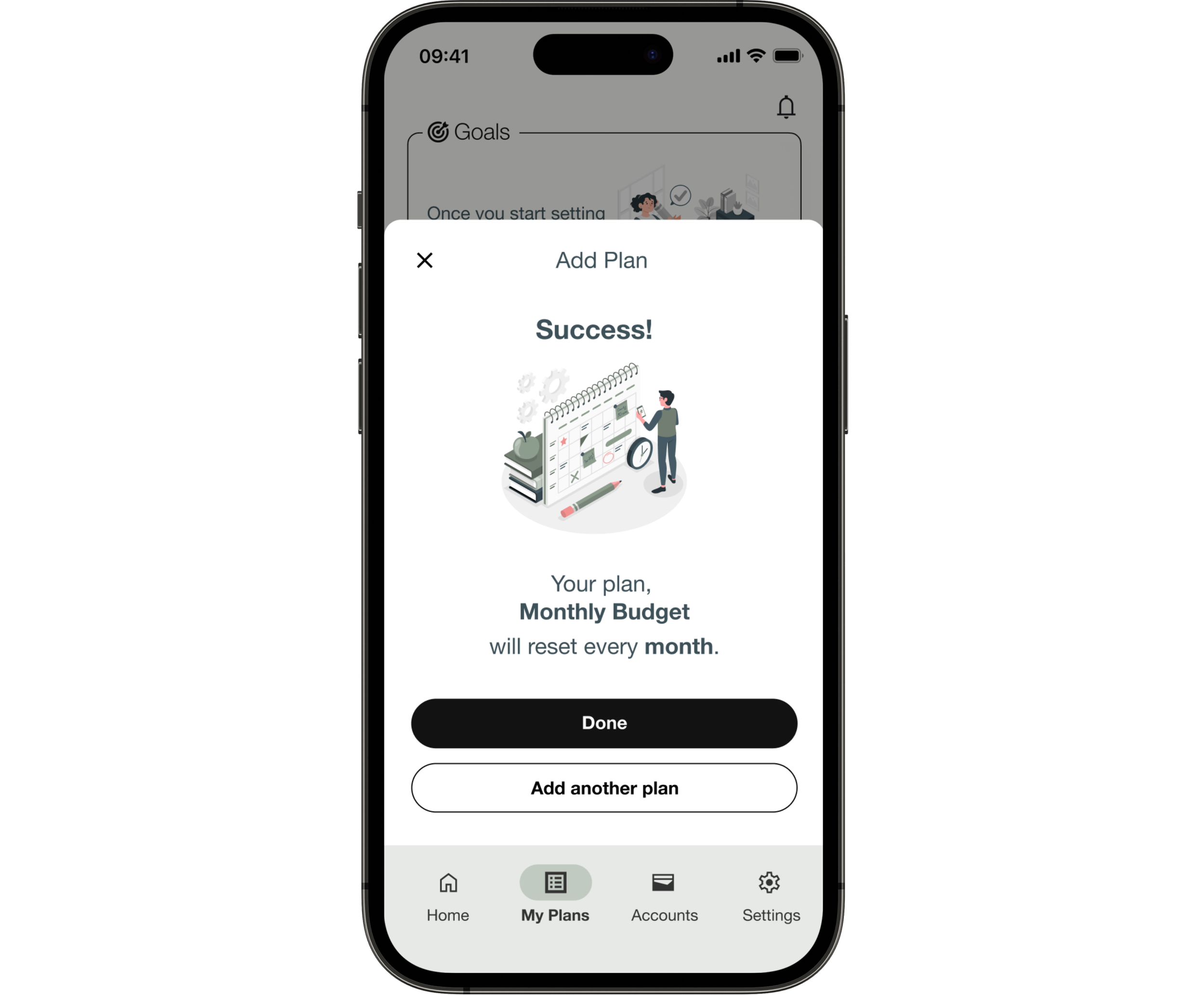
The Home Dashboard and My Plans pages, in particular, underwent extensive iterations based on user and peer feedback. For example, the flow of “adding a goal” was changed from a single forms page to multiple slides.
The shift from a single form to multiple slides for adding a goal wasn’t just aesthetic, but testing had shown that a long form triggered the same overwhelmed response that research had identified as the reason users abandoned finance apps in the first place. Breaking it into steps reframed the task as a series of small decisions rather than one large commitment.
After incorporating usability test findings, the prototype went through peer review, specifically focusing on UI elements that testing hadn’t fully surfaced, including contrast, affordance, and visual hierarchy.
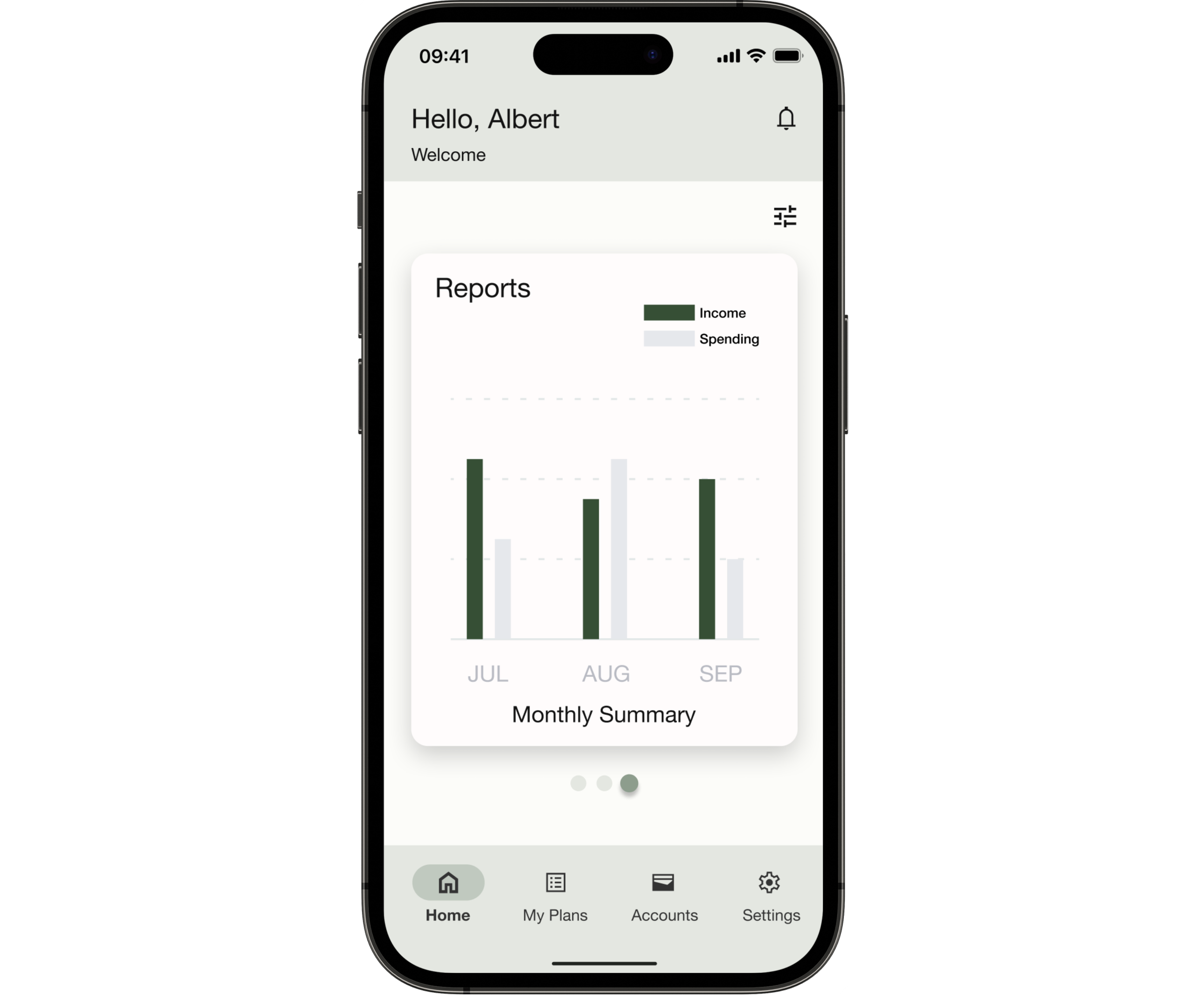
Final Design
Reflections
Challenges
The biggest challenge wasn’t a design problem. It was a process problem.
Working end-to-end alone meant there was no one to catch it when I went too deep into a direction that wasn’t working. Rapid prototyping made iteration fast, but it also made it easy to optimize the wrong thing. What pulled me back each time was structured feedback from peers, from testing, from stepping away and returning with fresh eyes.
That rhythm of building, testing, and being willing to throw things out is the most transferable thing this project taught me.
Next Steps
The refined prototype needs another round of usability testing, specifically to validate whether the structural changes to the goal-adding flow resolved the ordering confusion Issue #1 had identified. That’s the open question this project can’t answer yet.
Looking further out, the features that would meaningfully extend Pluto Pay aren’t the obvious ones. A community or blog feature matters less than getting the guidance experience right first. The research was clear that users abandon apps when they feel helpless, not when they run out of content.
AI-assisted recommendations and collaborative saving are worth exploring only once the core experience earns enough trust to make those features feel useful rather than intrusive.