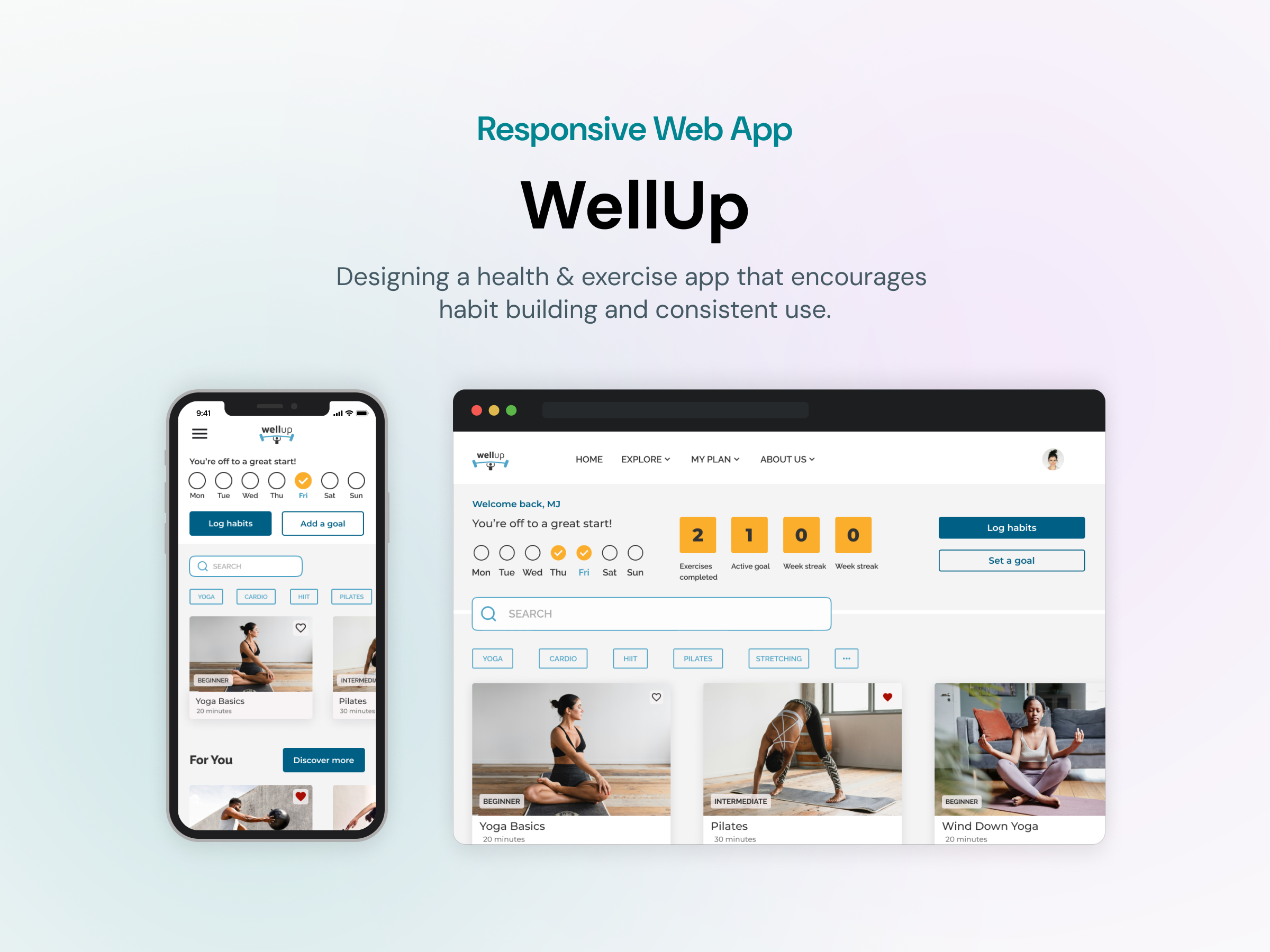
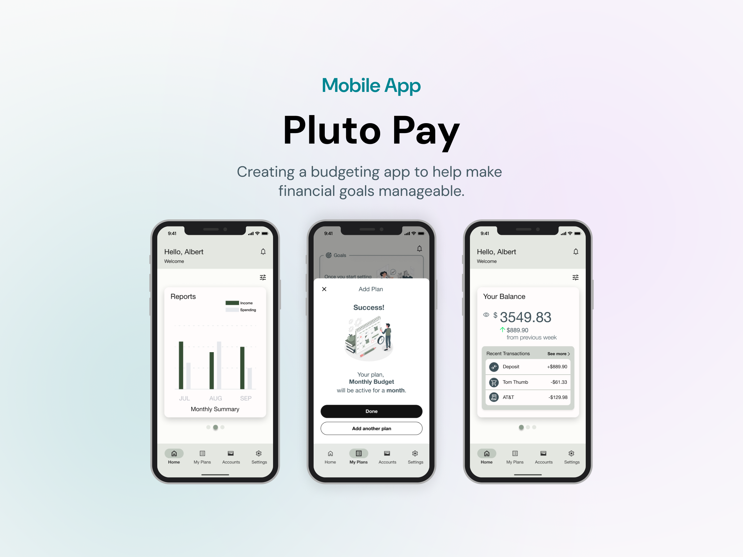
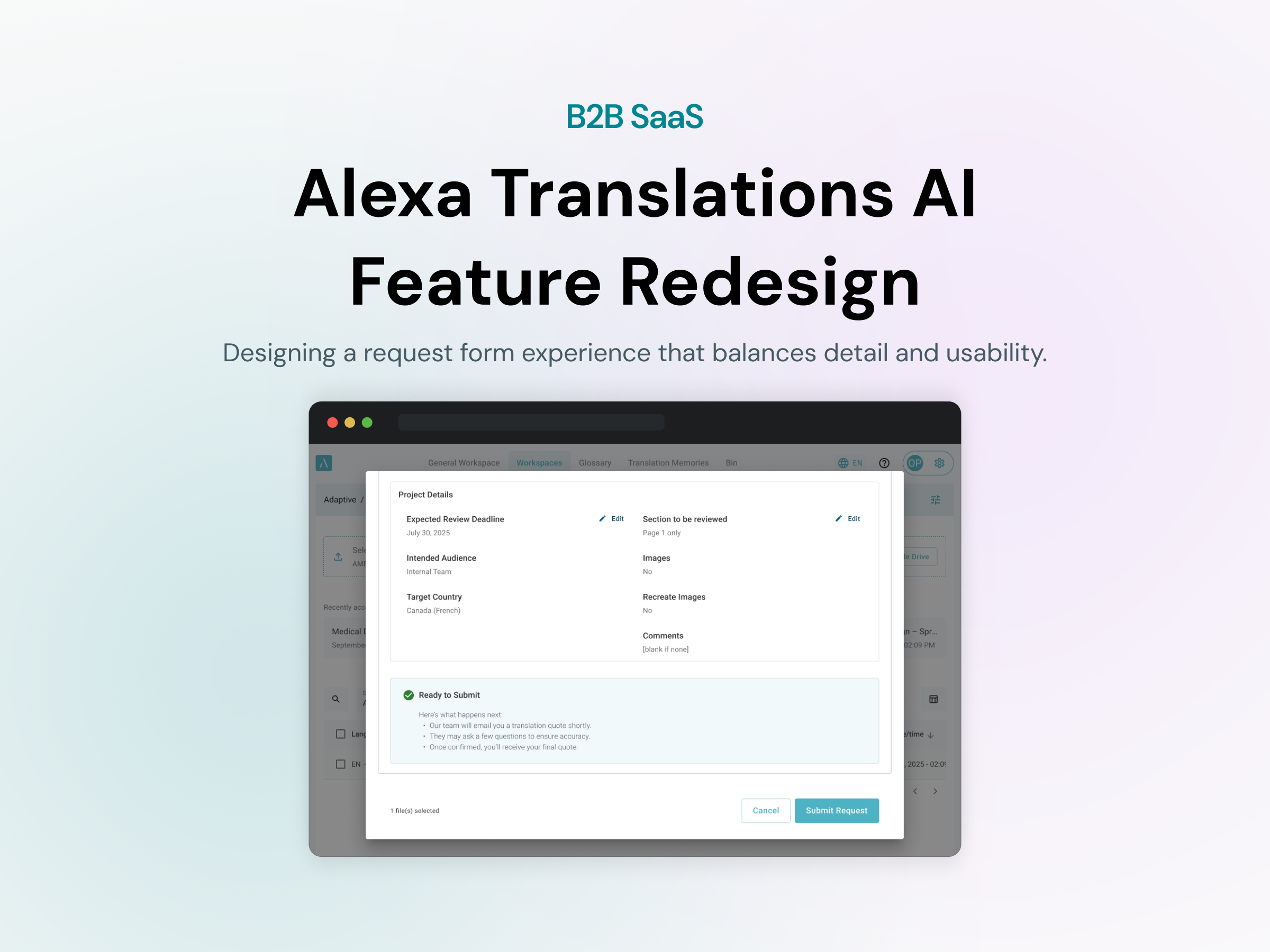
D-Tree
Overview
D-Tree is an ongoing project I worked on as a UX design intern at SJ Design Studio. With D-Tree, users can generate flows that serve as both self-help resources and scripts for customer service agents once published. The primary UI of the application enables users to construct a "decision tree," where each decision corresponds to a "node.”
The work involved designing a modal system for adding and editing product models, and a visual error feedback feature to guide users through validation errors without frustration or confusion.
Role
UX/UI Design Intern
Duration
May 2024 - July 2024
Team
Myself
3 Developers
Lead UX Designer
Tools
Figma
Modal to add and edit product models
The Problem:
The existing workflow had no dedicated path for managing product models. Users had to navigate away from their current context to create, edit, or delete a model — a friction point that slowed down a task that should have been quick and recoverable.
The goal was to bring that functionality into a modal without adding cognitive load to an already complex interface.
The Solution / Ask:
Design a modal interface that enables users to visualize existing models, delete non-default models, rename models, and add new models.
Essentially, each flow can have a set of models, that can represent things like actual product models (e.g., Samsung Frame TV) or anything the editor might want, such as an issue type (e.g., water damage).
DESIGN PROCESS
Research
My goal was to grasp the functionality of this tool before focusing on the modal. This led to an impromptu usability test using the latest build, where I navigated through tasks involving the modal I was designing, noting any bugs or usability issues encountered along the way.
Task Flow
Once I understood how to use the tool, I created a task flow for "adding and editing product models" to help guide the design.

First Iteration
After reviewing the task flow with the lead UX designer, I went straight into fleshing out the design.

Wireframes of two versions of the design.


Testing
This design was built into the existing D-Tree for testing. During the evaluation, one immediate usability issue surfaced:
Requiring users to click the edit button each time to modify text is inconvenient, especially when a new model is added. The user's initial action is often to rename the newly added model, making the current process inefficient.
To resolve this issue, I plan to remove the edit button and allow text editing to be activated by clicking the text. When new models are added, the text should be highlighted by default, allowing the user to immediately rename the model.
Next Steps
My next task is to iterate on the design with the feedback from testing and handoff to the developers to build into the MVP.
Visual error feedback
The Problem:
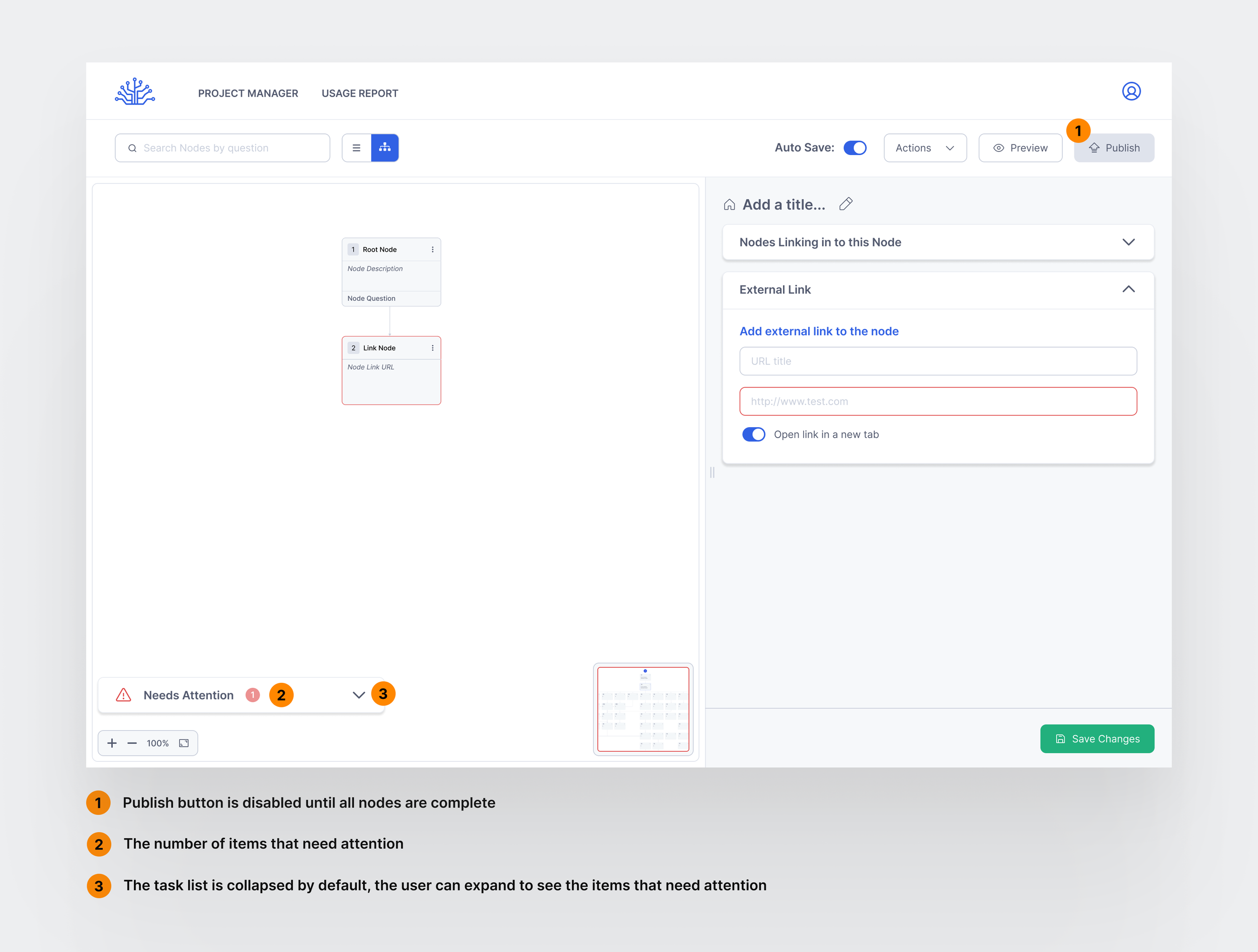
For the user to publish a Tree, all the nodes need to be completely filled. When there were nodes with missing information, there was nothing in the UI that alerted the user why their Tree could not be published.
Error states in the existing interface were binary. Something was wrong, but the system didn’t say what or how to fix it. For users working through complex product configurations, hitting a wall with no guidance meant either guessing or abandoning the tree. The design challenge was building a feedback system specific enough to be useful without overwhelming an already dense interface.
The Solution
Design a visual feedback system to notify the user of any unfinished nodes that need to be edited before the flow or “Tree” can be published.
First Iteration
Due to the dev team having a meeting where they needed to present on their progress, they asked for a quick and simple feedback to implement into the latest build for demo purposes.
So I designed a simple toast style alert notifying the user that their 'tree' could not be published due to incomplete information related to the 'nodes':
Notification for when the user clicks “Publish” when there is a node that doesn’t connect to anything:


Notification for when the user clicks “Publish” when there is a node with incomplete information.
⚠️ However, there were some obvious issues with this style of notification:
It overlapped with other alerts that showed up as a toast notification (such as autosave notification, which showed up frequently).
The user could forget what the issue was as the message would eventually disappear, leaving room for repeated mistakes and frustration from the user.
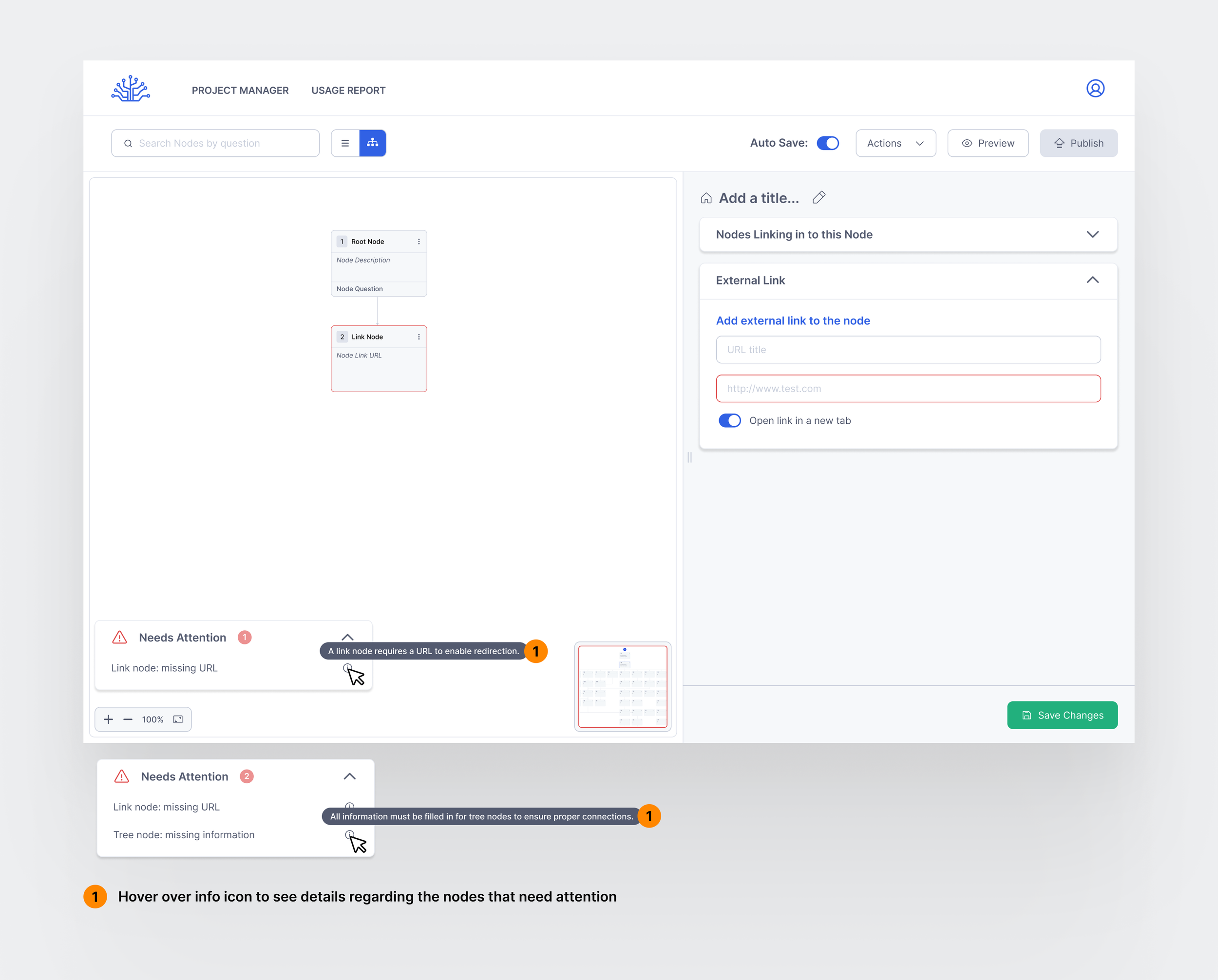
There are 4 different types of nodes that can be created. There would have to be more variations of the toast copy to cover all the different scenarios when a Tree can’t be published.
Some examples of scenarios that needed customized copy are:
A Tree Node allows the node to be connected to another Tree. The user needs to select which Tree the Tree Node is going to and what node it should return to once the necessary steps are taken.
A Link Node needs a URL for the user to be redirected somewhere.
A node could be unreachable because it does not have any inbound connections.
From there, a secondary problem was formed:
How might we create a way to communicate error messages that catches all the different scenarios when a user needs to input additional information in order for nodes to function.
Research
I went back to the drawing board and did some research on other similar error feedback systems. I also drew inspiration from user onboarding checklist formats, which allow users to visualize unfinished tasks.
Second Iteration
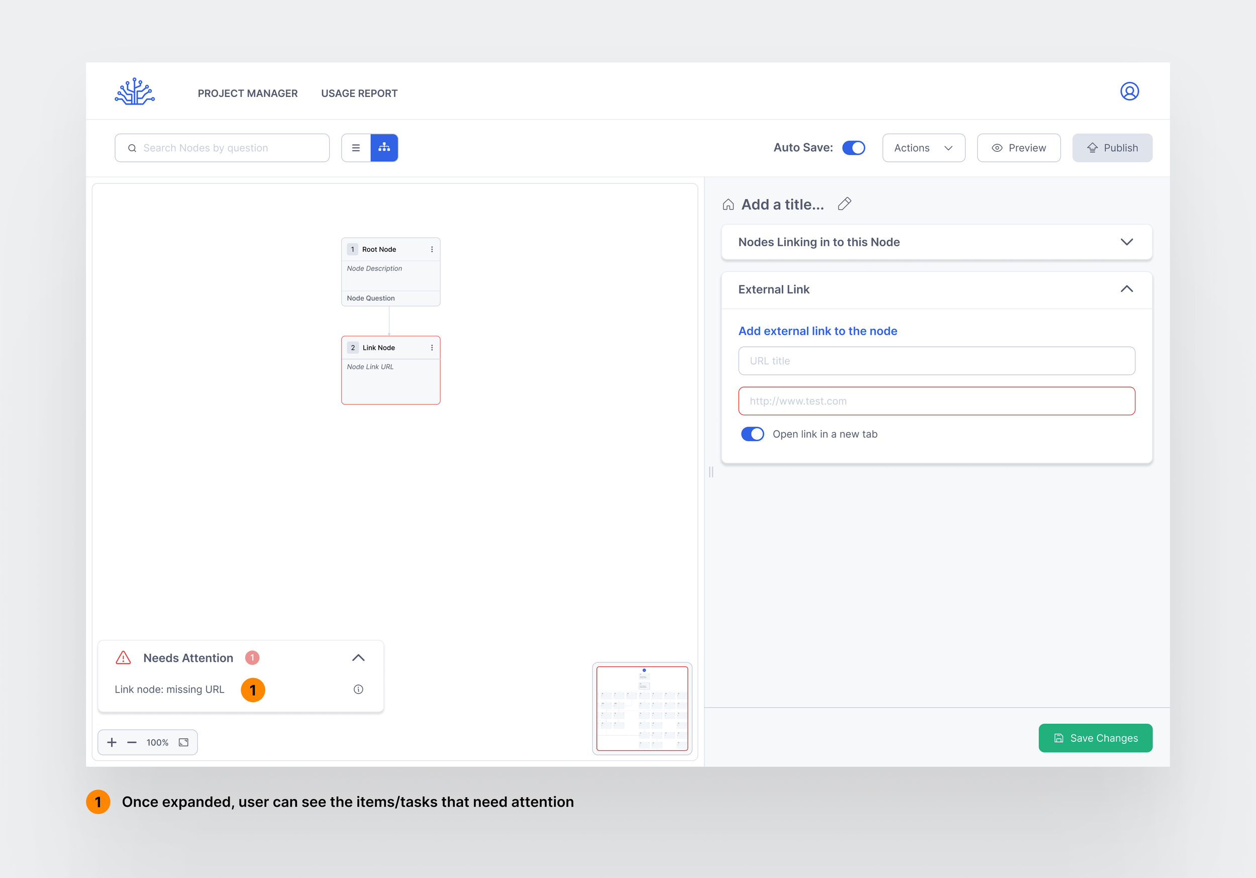
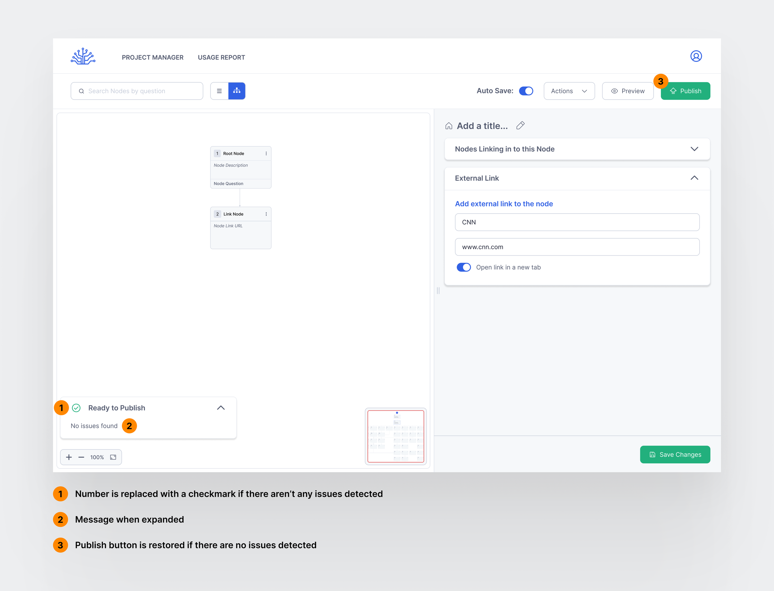
An error feedback system that utilizes the Zeigarnik Effect, by showing a list displaying outstanding tasks to help users see what still needs attention, rather than requiring them to manually go through a list of tasks. The design will show a number that minimizes with each resolved task may motivate users to address the issues themselves before seeking external help.
If It Works: How We’ll Know
Designs have been communicated to the team and handed off to the developer building this feature. Once implemented, the priority is validating two specific questions the design can’t answer yet.
The first is Error Resolution Rate — what percentage of users encountering an error are able to resolve it independently using the feedback provided, without escalating or abandoning the task. A high rate would confirm the feedback copy and structure are doing their job.
The second is Error Recovery Time — how long it takes a user to move from encountering an error to successfully resolving it. Shorter times would indicate the feedback is specific enough to act on immediately rather than requiring interpretation.
Learnings
Working directly with developers changed how I think about design decisions.
Feasibility conversations that happen late cost more than those that happen early. I learned to ask the uncomfortable questions upfront rather than discovering constraints after a direction was already committed to.