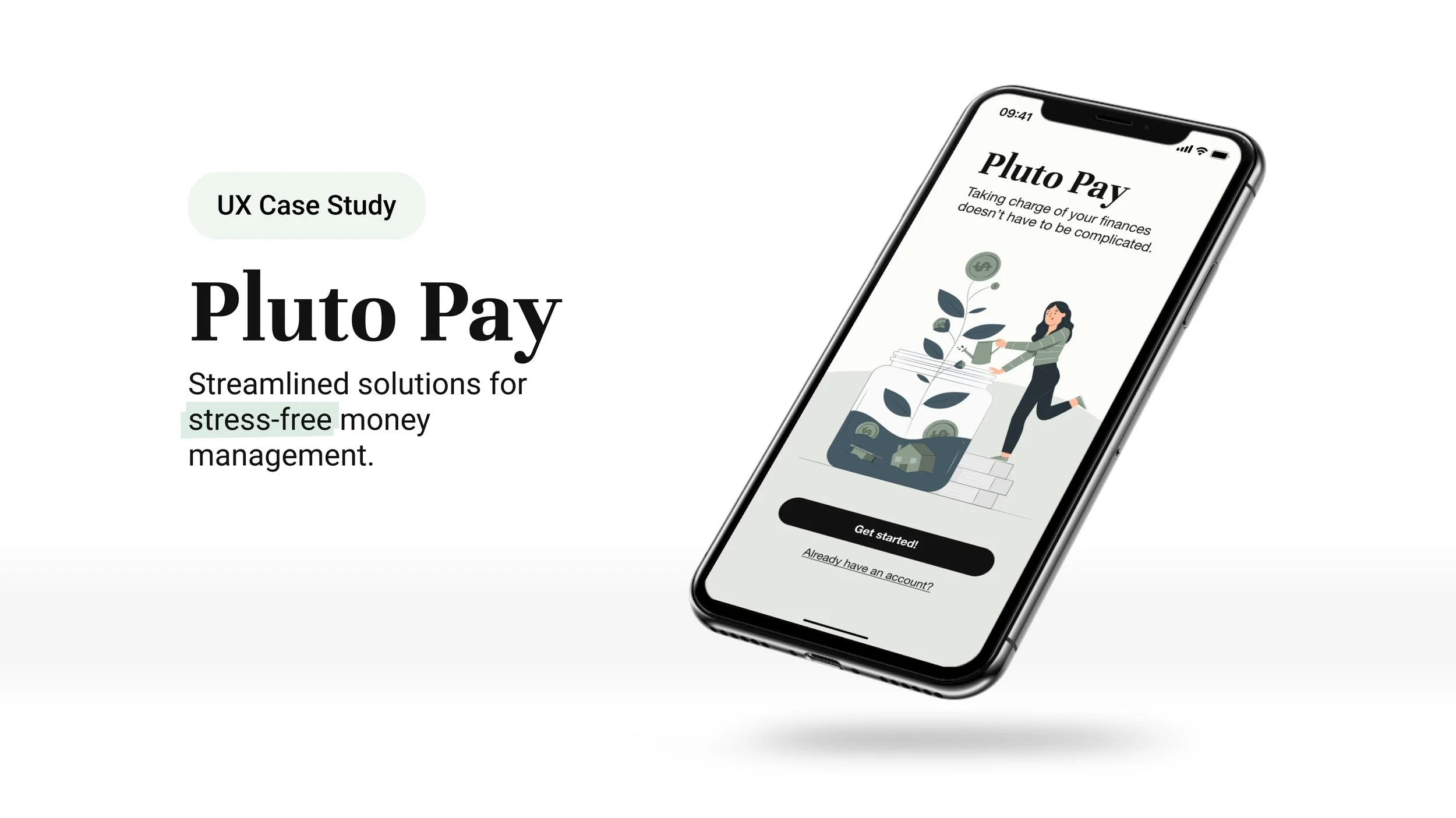
Overview
Pluto Pay is a personal money managing web application focused on making budgeting easy and empowering individuals to achieve their savings goals
This was a conceptual project I worked on as part of my UX design program at CareerFoundry.
Role
Sole UX/UI Designer and Researcher
Timeline
June — December 2023
The Problem
The fintech landscape has grown rapidly, giving rise to a wide range of money management applications.
Yet, despite the abundance of tools available, many people still find managing their finances to be complex and overwhelming.
Proposed Solution
A personal finance web app with a minimalist interface guided by Hick’s Law and Miller’s Law — reducing cognitive load, simplifying choices, and helping users focus on what truly matters without feeling overwhelmed. The goal was to make financial management feel approachable and stress-free, while encouraging healthier money habits.
Tailored for users aged 25-45 with varying levels of financial confidence, the app empowers user to start planning for multiple savings goals with ease.
Discovery
Competitive Analysis
I deep dived into two widely used money management applications, Mint and NerdWallet, to identify opportunity areas that could be filled with Pluto Pay.
User Research
Having identified where opportunities exist, I wanted to get a deeper understanding of our potential users.
First, I conducted a survey with responses from nine individuals, followed by one-on-one interviews with three participants.
Goals:
Identify users’ general attitudes and feelings about goal setting and the process of reaching a goal.
Discern the types of tasks users perform to reach financial goals, and identify their thoughts on each task.
Identify the beneficial features of the personal finance management applications that users have experimented with or are currently utilizing.
Key Insights
Organizing interview data with affinity mapping
Users want clarity
Many apps that go beyond tracking expenses can be overwhelming. Users want an easy and simple set up process and they want to know exactly how the app will help them better manage finances.
Users want granularity
Not many free services offer a breakdown of spending into categories and this is something all participants verbalized a want for.
Users want guidance
One of the reasons users abandon a finance app is because they feel helpless in how to fix a financial hiccup and they desire guidance on how to get over it.
User Personas
With the insights from research, I created two personas to realistically portray Pluto Pay’s target audience and to help visualize who I was designing for.
Ideation
Key Features
Once I felt that I had a good understanding of the opportunities Pluto Pay could address in alleviating user pain points, I started to organize the key features.
Budgeting: Users will have budgeting tools to help them allocate their income to different expense categories and keep within their desired spending limits.
Goal Setting: Users will be able to set specific savings goals, whether for short-term or long-term expenses like a vacation or major purchase.
Customizable Categories: Users will be able to create customized expense categories based on their own unique lifestyles.
Expense Tracking: Users will be able to track and categorize their spending.
Synchronization with External Accounts: Users will be able to sync their bank accounts and credit cards with the app for real-time transaction updates.
Personalized Tips & Recommendations: Users will receive personalized tips and recommendations based on their spending habits.
Alerts & Reminders: Users will receive notifications and reminders about savings goals, or unusual spending patterns. Notifications preference will be customizable.
Secure Account Access: Ensure robust security measures, including biometric authentication and encryption, to ensure the safety of users’ personal information.
User Flows
With the key features outlined, I created user flows for primary tasks to start illustrating the information architecture of Pluto Pay and to address potential areas of user frustration or roadblocks while performing these tasks.
For the sake of brevity, only a couple of the initial user flows are showcased below.
Ideation Prototyping
Low- to Mid-fidelity Wireframes
As I started sketching the wireframes, I quickly realized the challenge: how could I fit all the necessary elements for each user flow while sticking to my original goal of not overwhelming users.
Feature: Add a Plan (mobile)
Sign-up & onboarding
“My Plans” page onboarding: adding Plans & Items
Usability Testing
Goals of the test was to answer these questions:
Are the feature flows intuitive?
Do the users find the app easy to learn and navigate?
Are there any pain points in the task flows related to navigation and setting up a new budget plan and goal?
Usability Test Report
On a scale of 1 to 5, with 1 representing the least difficulty and 5 representing the highest level of difficulty, the collective average score given by all participants for all tasks was 1.6. Despite the positive feedback, the following is a list of challenges and errors experienced by the participants.
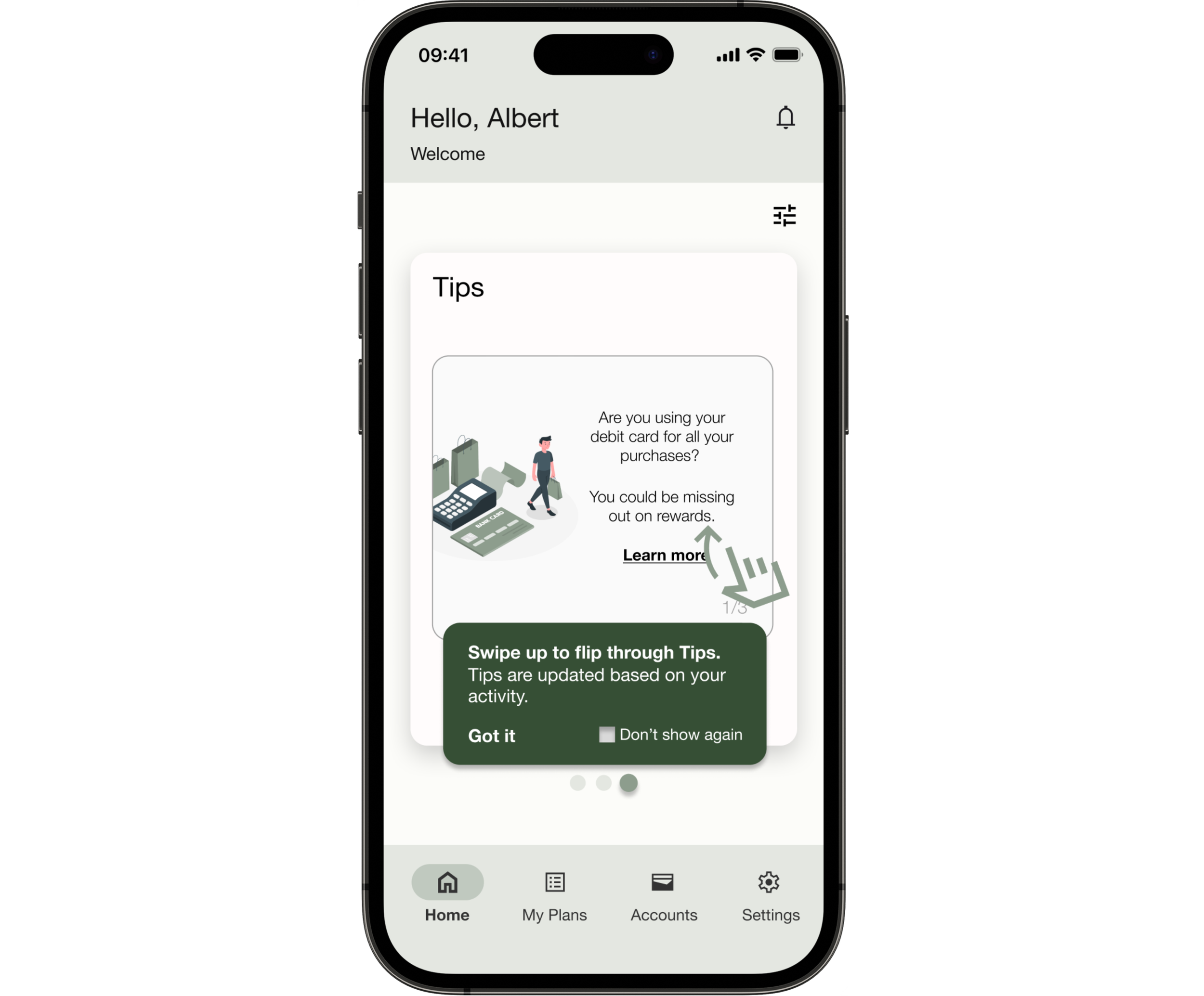
One important aspect of testing the prototype was to make sure the onboarding was clear and helpful.
The feedback wasn’t perfect, but it confirmed that the tool tip design of onboarding was the right choice. By the end of the testing, I learned I needed to work on improving how the users would navigate around the tool tip.
Affinity mapping and rainbow spreadsheets were methods used to organize the findings from the usability test.
Key Insights
Balancing simplicity and clarity
Participants appreciated having the complexity of managing money simplified but oversimplification lead to confusion at certain points during navigation.
Prioritizing comprehensive consideration in user flows
When creating task flows, it’s important to take more time to consider all the possibilities and edge cases to avoid road blocks.
Tool tips: more favorable with improved design
Although there was confusion about how to navigate from the onboarding tool tips, by the end of the test session, all participants stated they preferred this type of onboarding when learning how to use a new app.
Polishing the Design
Iterations & Revisions to Improve Accessibility
After I implemented the suggested changes made from the user testing results to the prototype, it was also reviewed by peers who offered valuable insights primarily on UI elements but also addressed any lingering points of confusion or frustration in the key features.
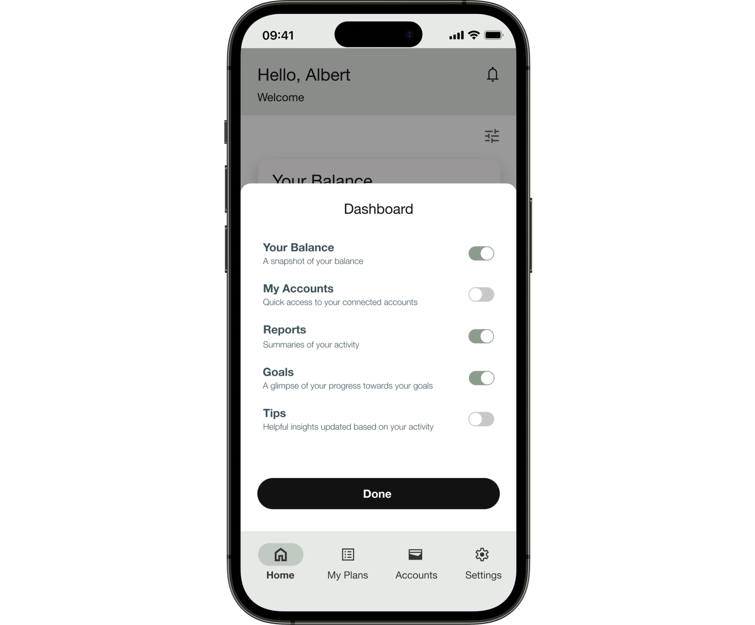
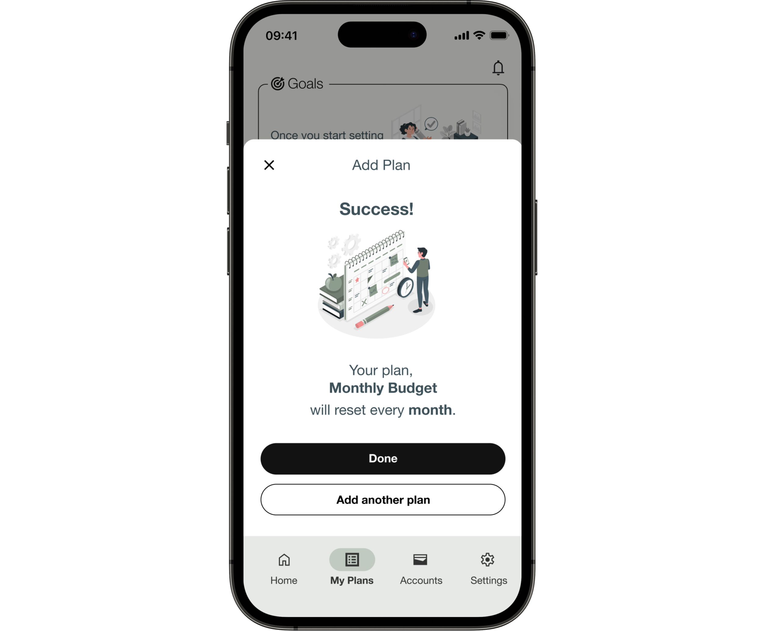
The Home Dashboard and My Plans pages, in particular, underwent extensive iterations based on user and peer feedback. For example, the flow of “adding a goal” was changed from a single forms page to multiple slides. The initial form design seemed lengthy so it was redesigned to avoid deterring users.
Next, I revisited and revised designs requiring improvement in terms of accessibility, addressing elements such as acceptable color contrast, font size, and adding supplementary labels for enhanced user experience.
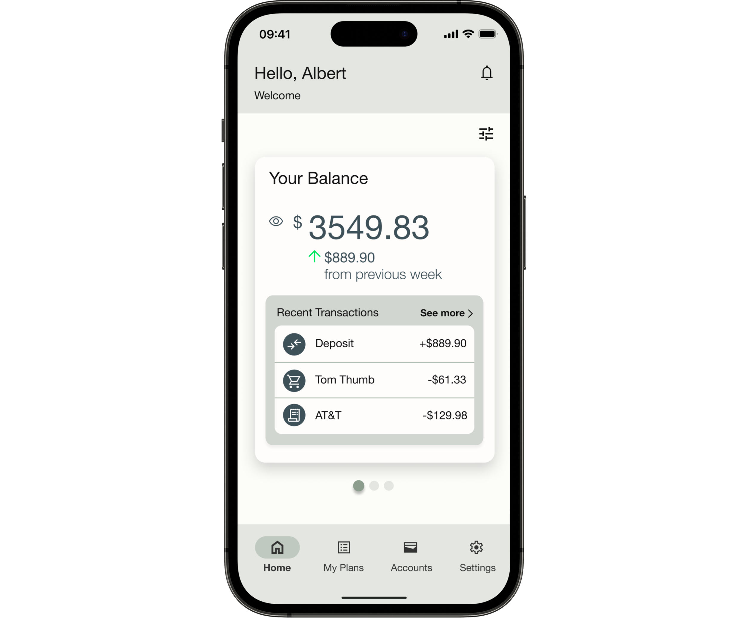
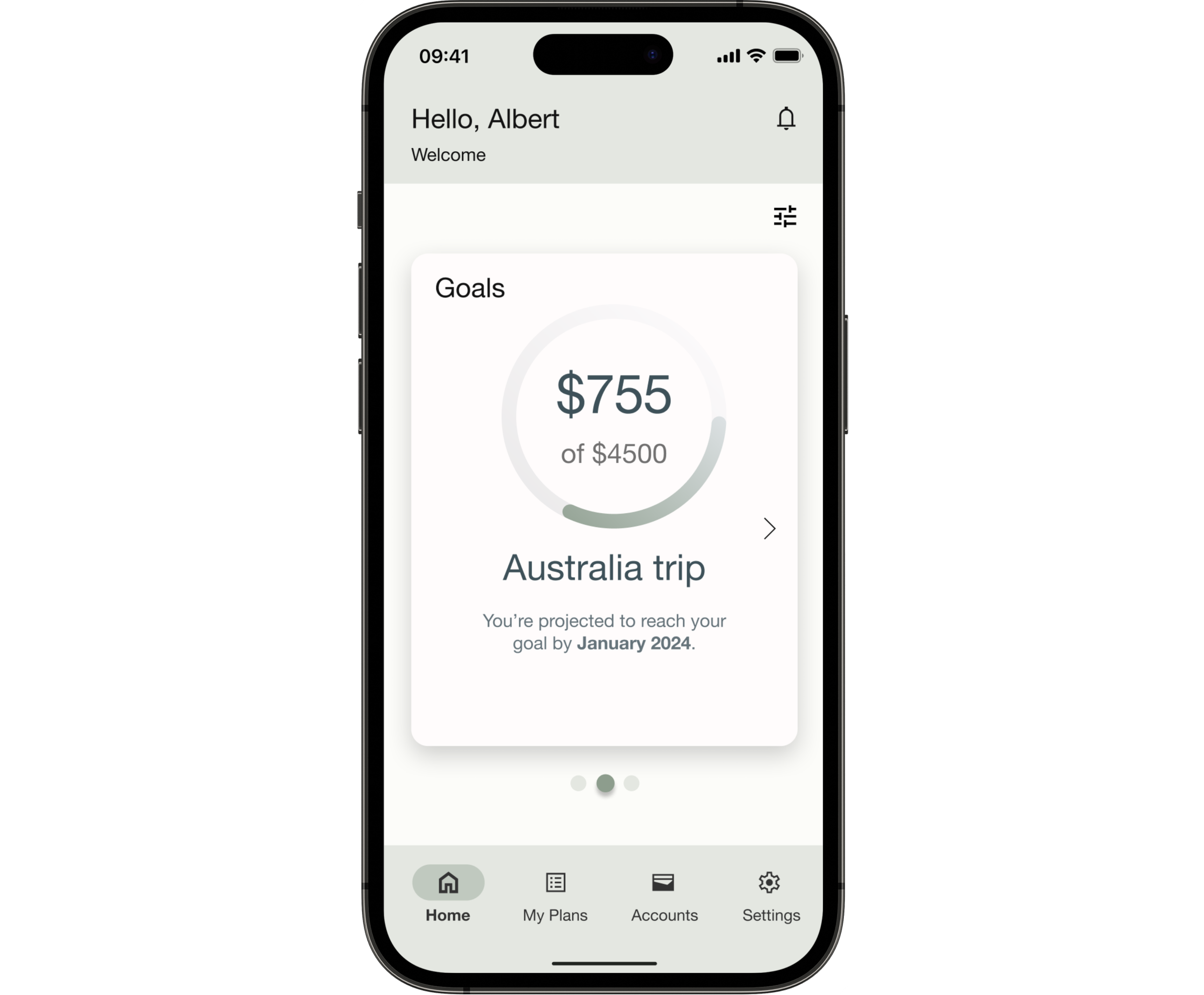
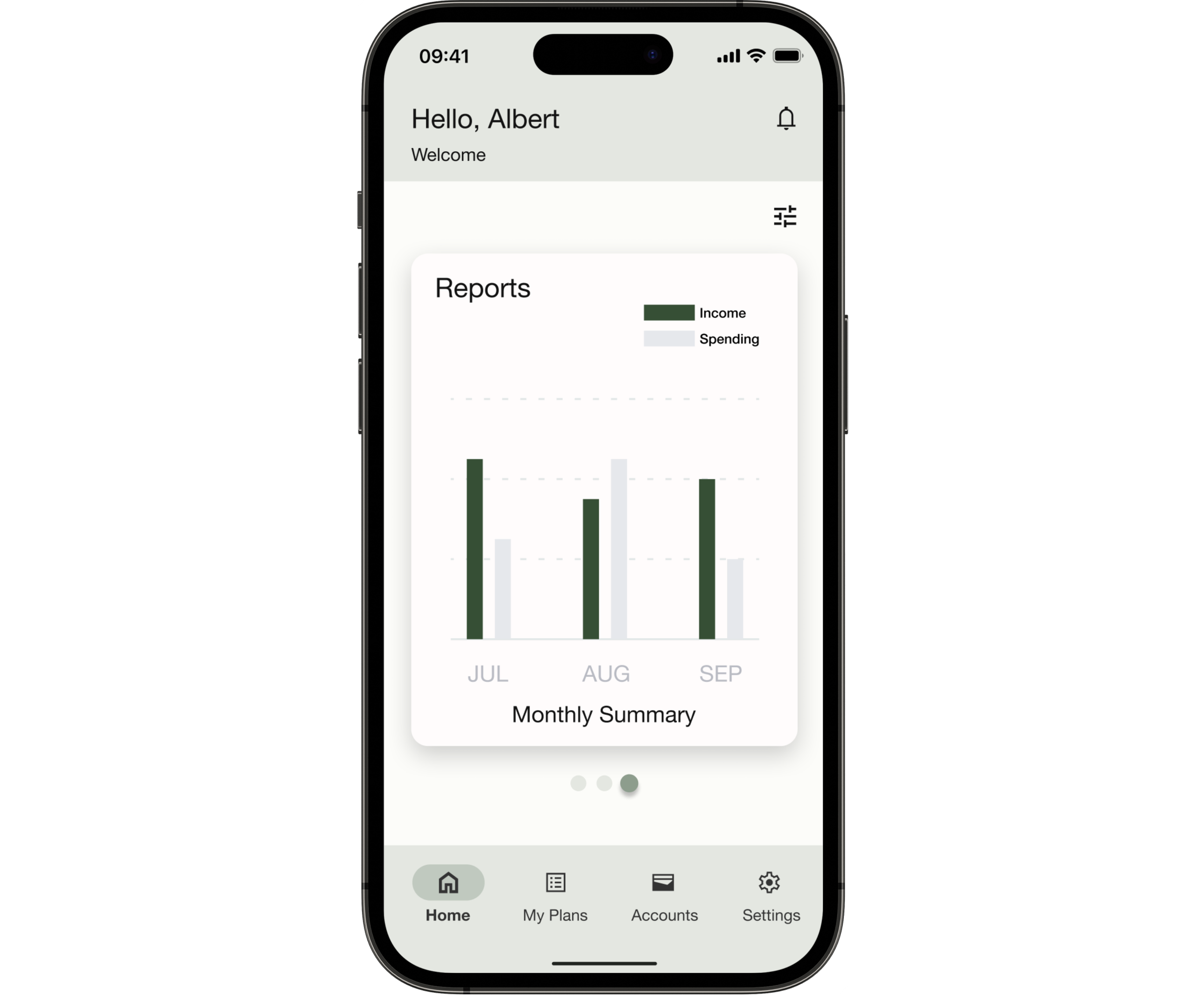
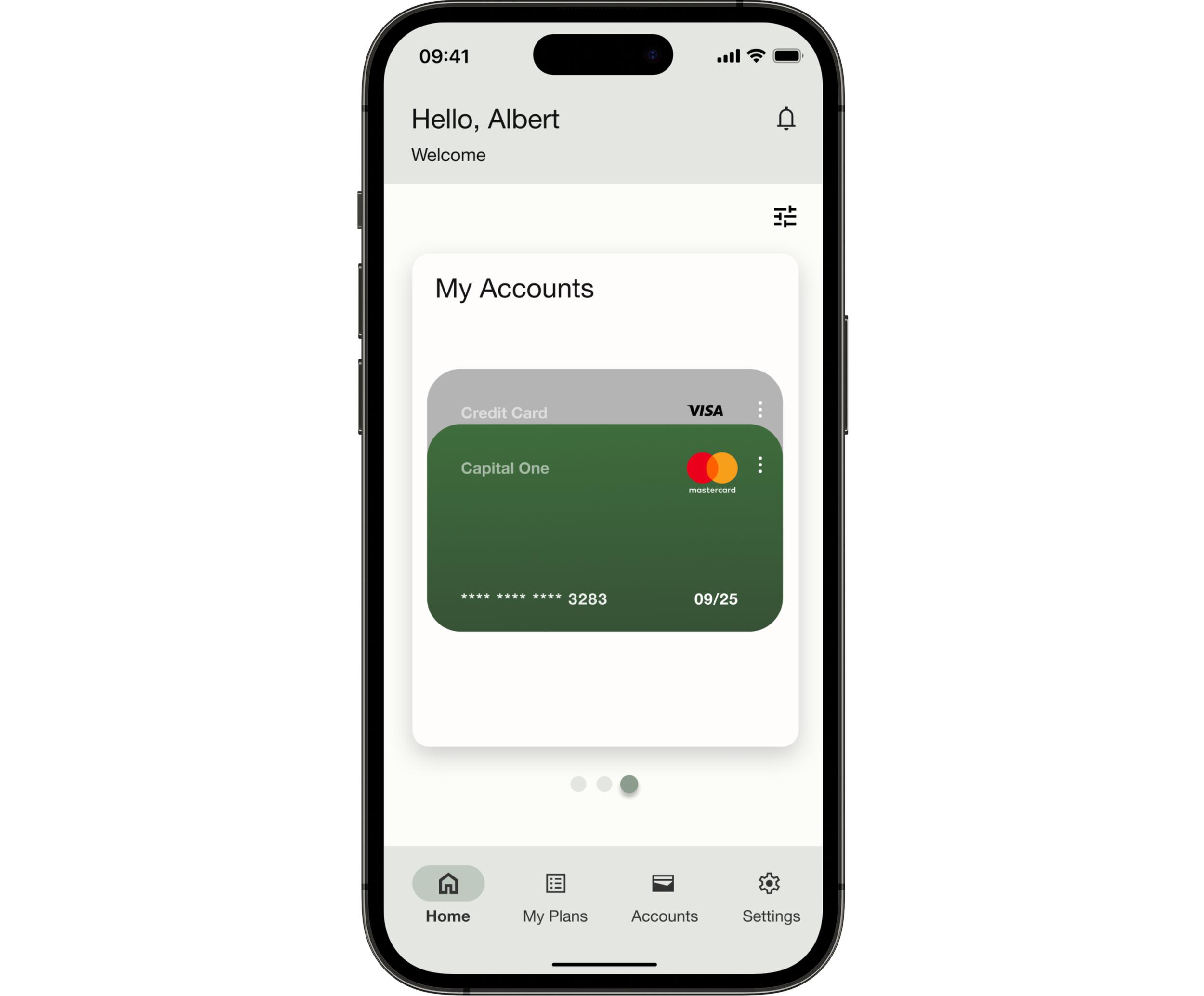
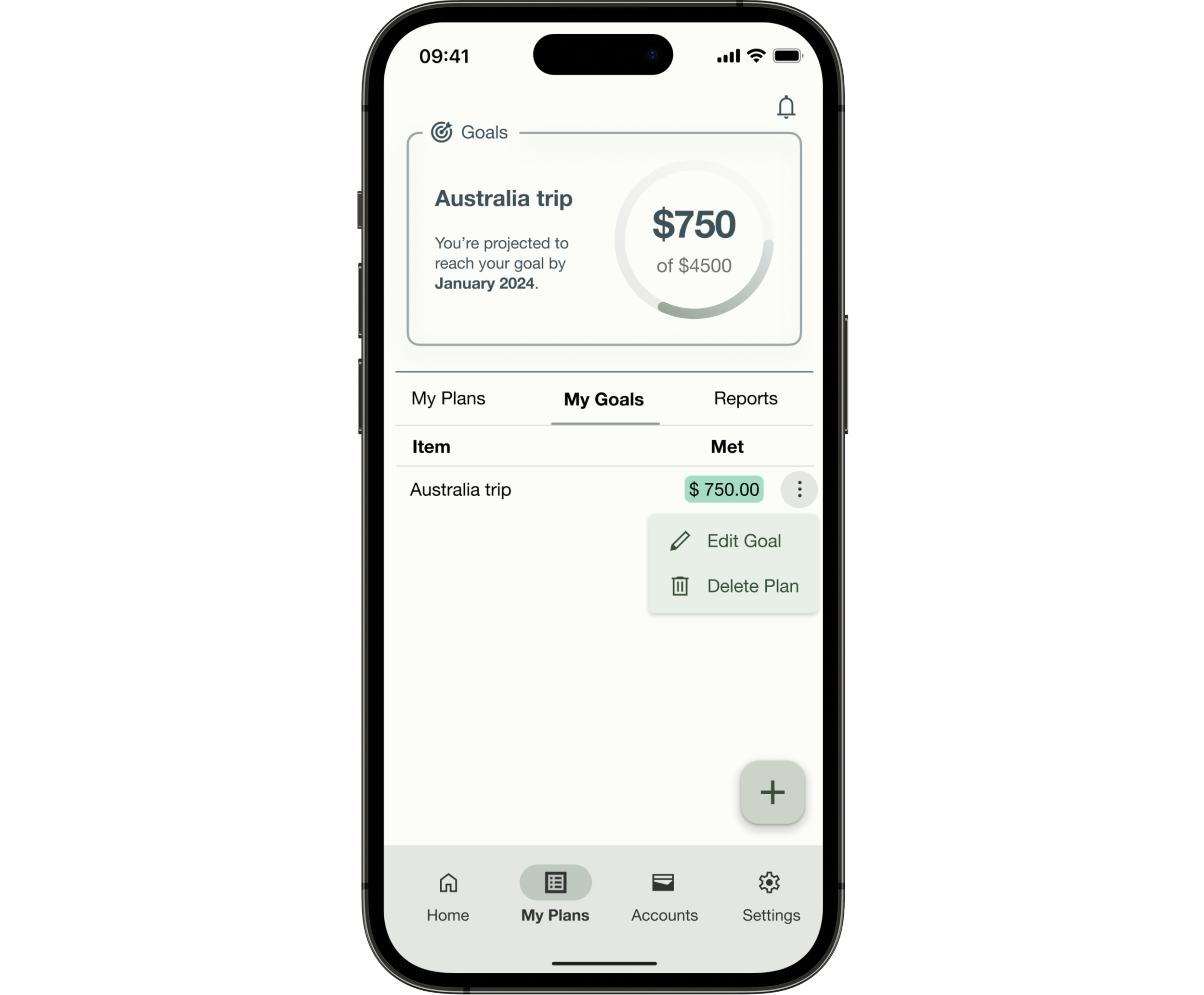
Final Design
Learnings & Future Steps
Challenges
Taking on an end-to-end design process alone was a valuable learning experience in my journey to improve my skills as a UX designer, researcher, and strategist.
Responsive web design, making sure all elements were scalable and could seamlessly expand to larger screens.
Learning to trust the iteration process rather than getting bogged down in attempting to perfect each step.
Rapid prototyping proved both advantageous and challenging. While it facilitated swift design iterations, there were instances when I delved too deeply into a particular design direction. Fortunately, having a mentor, tutor, and supportive peers played a crucial role in guiding me out of these situations and getting back on track.
Next Steps
The refined prototype will need to go through another round of user testing to validate its effectiveness and to ensure it aligns with users needs and meets the intended goals.
Any new changes or additional screens will need to be audited for accessibility.
Features for the future:
Community feature/blog
Integration of AI chatbots
Collaborative saving with other users (family, friends, etc.)