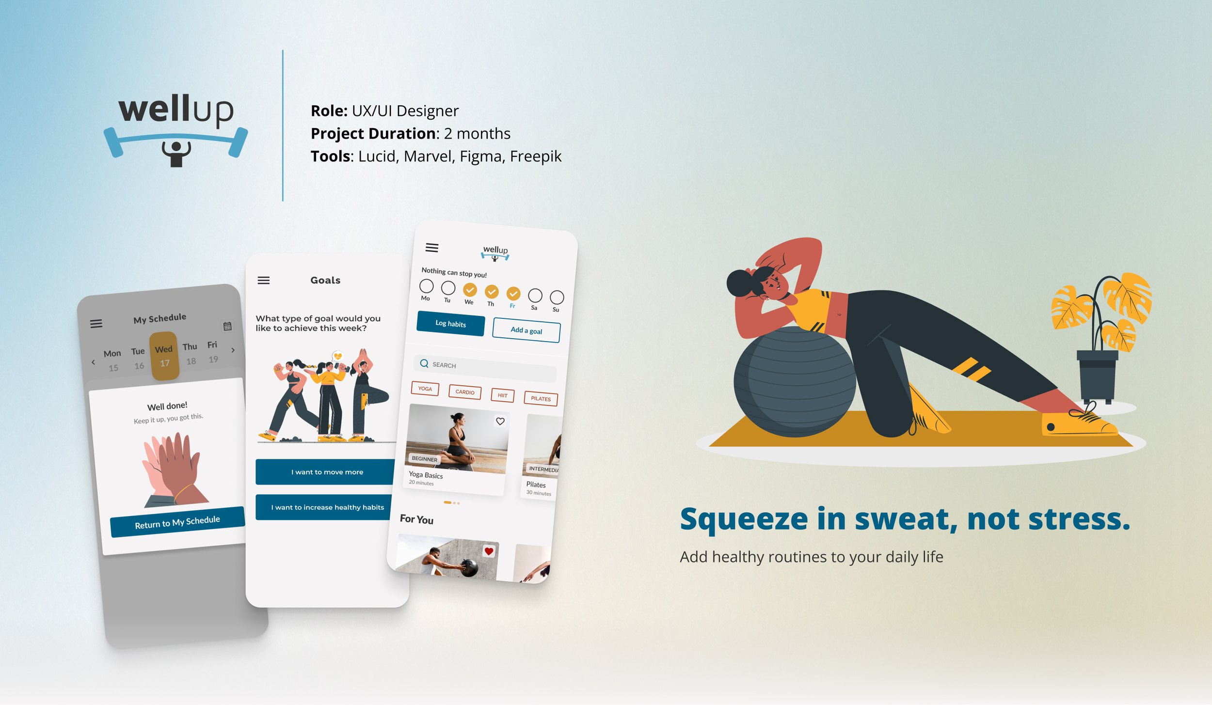
Overview
WellUp is a responsive web application designed to address the challenge of integrating a personalized exercise routine into the hectic schedules of individuals, particularly those new to or returning to fitness.
This product was developed as part of my UI design specialization course at CareerFoundry. While it remains a conceptual endeavor, it served as a valuable opportunity for enhancing my time management abilities, maintaining project coherence, soliciting and integrating feedback, and refining my visual design skills.
As this project’s main focus was UI design, the project brief provided the problem, user persona, and partial branding guidelines. Using the given information, I selected the user stories pertinent to the target audience to inform my design choices. Additionally, I conducted all supplementary research independently.
The Problem
Many individuals, especially those new to or returning to fitness, struggle to incorporate personalized exercise routines into their busy daily schedules.
Goals
Create a responsive web application that will:
Motivate people into an exercise routine that suits their level, schedule, and interests.
Allow users to search and view routines, guides, daily challenges, and other information on any device and integrate these with their personal calendar.
The Process
Define — User Persona
A user persona helped me focus on specific features that would meet the identified needs and preferences of our target audience.
I continually referred back to it to inform my decision-making throughout the design process, ensuring that each element of the interface was purposeful and aligned with the goals and motivations of our potential users, like Rebecca.
Define — User Stories
Ideate — User Flows
First Steps of Ideation
The user stories were thoughtfully translated into flows.
This helped create the framework for each task’s wireframes and to ensure that every step and interaction was accounted for and aligned with their goals.
Ideate — Wireframes & Prototype
Designing with a mobile-first approach laid a solid groundwork for scaling up to larger breakpoints effectively.
By establishing a strong foundation at this initial stage, I was better equipped for a smooth transition across different screen sizes, maintaining consistency and coherence throughout the user journey.
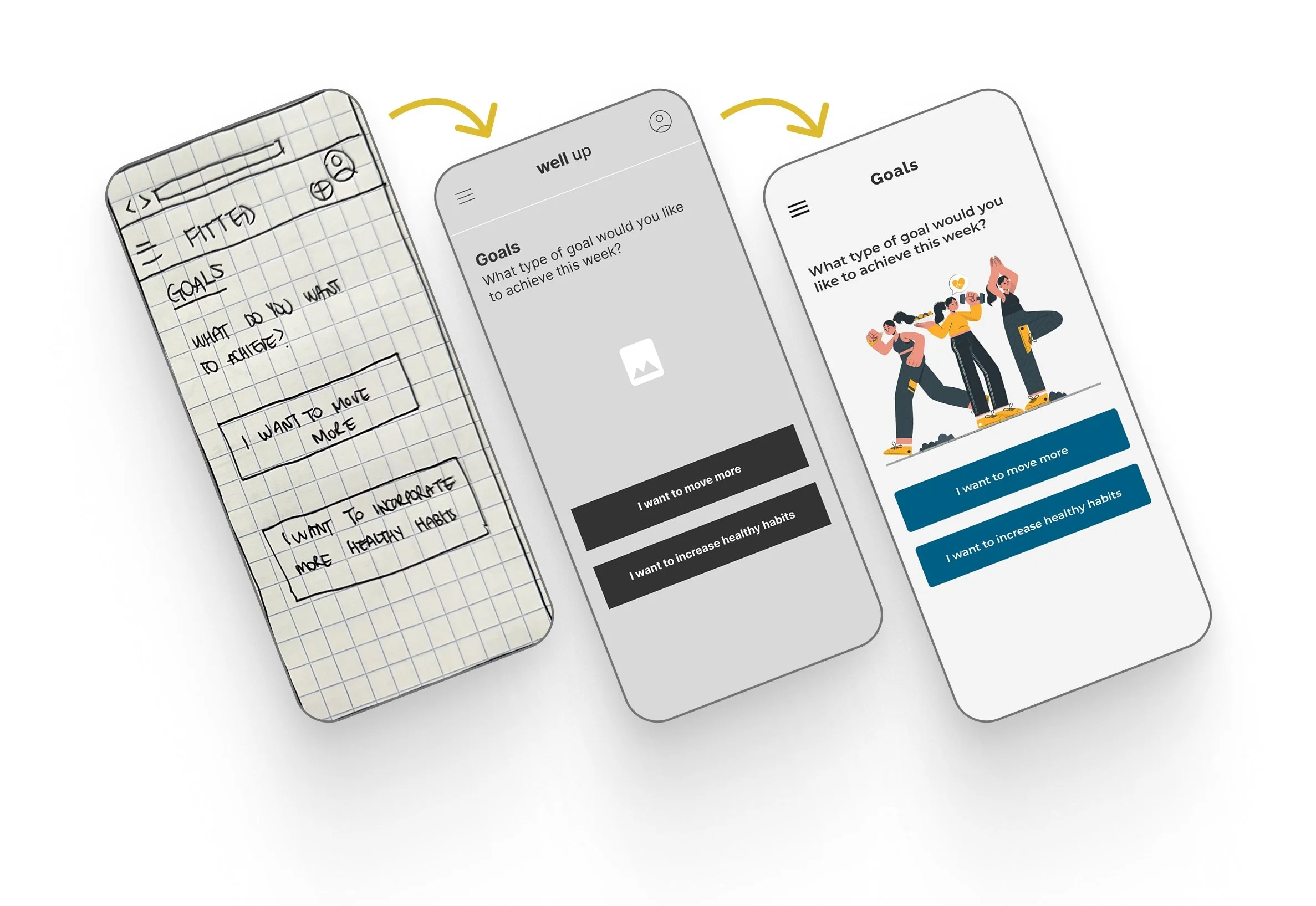
Validate — User Testing
An MVP was created (using Marvel) with the first round of low-fidelity wireframes sketched on paper and tested with 2 users to gather feedback, identify any issues with completing tasks, and iterate on the design before moving forward with higher-fidelity iterations.
Key Findings
Users expressed uncertainty regarding the distinction between the search function and the "Discover more" button.
There was confusion surrounding the identification of buttons and some calls to action (this may have been exacerbated by the pen-and-paper format of the prototype).
Validate — Revised Prototype
With the feedback, a revised prototype was created on Figma.
What Changed?
The "Discover more" button was removed from the design. After considering the task flow of the “Discover more” button, I determined it could be streamlined with the search function.
Buttons and calls to action have been made more distinguishable with the use of contrasting colors.
Searching Exercises & Filtering Results
Ideate — Visual Direction
Mood Boards & Style Guide
Given the partial branding guidelines, I enjoyed exploring visual directions that balanced creative expression with consistency to the brand.
I decided to move forward with the second board as I envisioned the use of illustrations to create a playful, less-serious environment to encourage those who may not be as motivated to exercise.
Ideate — Accessibility
Continuous Auditing & Iteration
One of the biggest UI challenges was selecting a color palette that was both harmonious and motivating, while also meeting WCAG standards for contrast.
To streamline this process, audits were conducted with each new iteration.
Deliver — Designing for Different Breakpoints
Mobile
Focus on simplicity and efficiency
Single row of content for each section
Font sizes and button dimensions optimized for touch interactions, ensuring a comfortable experience on smaller screens
Hamburger menu to conserve space and display the exercise cards clearly
Tablet
Additional screen real estate used to introduce a grid layout for less horizontal scrolling and more content visibility
Hamburger menu was retained to optimize space
Typography and imagery scaled proportionally, maintaining legibility and visual appeal
Desktop
A more expansive layout.
Navigation changed to a traditional top bar, offering enhanced visibility and ease of access.
Users can view more statistics on their progress on the home dashboard, assuming users accessing from their desktop may want to delve deeper into their details with ease.
Deliver — Hi-fi Designs · Features
🎯 Goal Setting
Users have the option to set weekly goals for exercise or simple healthy habits, like beginning the day with a glass of water.
Their daily activity can be logged, tracked, and viewed directly on the home screen.
📅 Planning an Exercise Routine
Users can create their own schedule on the app and customize reminder settings, making it easy to jump in when it's time to exercise!
💪 Encouraging Progress
Life happens. If users aren’t able to stick to their planned workouts, they are encouraged to try another day with convenient access to the scheduling feature.
Reflections
🎨 Aligning Visual Direction with Functionality
The Situation:
Even though I selected a mood board to guide my visual design direction, I had to make numerous adjustments to the UI to ensure accessibility, feature integration, and effective content layout.
Lesson Learned:
When working within a team, I would make it a priority to effectively communicate and cross-reference the conceptual vision with the planned features alongside the rest of the team.
📱 Mobile-First Requires Ruthless Prioritization
The Situation:
Designing with a mobile-first approach, I realized the importance of prioritizing essential features and content due to limited screen space.
Lesson Learned:
I learned to focus on core functionalities and continue to practice streamlining the user experience for smaller screens.
Future Direction
Further build on the gamification aspect; award users for consistent activity on the app, award achievements, and add motivating reminders.
Design functionality that enables integration with wearable health devices while incorporating AI-driven biometric insights and recommendations.
Test, iterate, and repeat!