Request a Review feature at Alexa Translations AI
Designing a request form experience that balances thoroughness and usability.
-
🧭 Context → As a Product Designer Intern, I led research, ideation, and usability testing for a redesign of the Request a Professional Review feature in the Alexa Translations AI platform.
The goal was to balance the needs of client requestors with the requirements of the LO team and create a workflow that felt clear and supportive rather than confusing or burdensome.
🎯 Outcome → While engineering priorities meant my explorations weren’t green-lit for hand off during my time with the product team, my work ensured the client’s perspective was represented alongside internal team needs, strengthened design documentation, created baseline usability testing results, and set up a foundation that made future handoff and validation faster for the team.
Role
Product Designer Intern
Timeline
June - July 2025
Status
Deferred to a future quarter due to engineering prioritization
Deliverables
UX research plan
Executive summary of user interview insights
Mid- to high-fidelity wireframes
Interactive prototype
Uusability test plan & report
Background
Alexa Translations is a Toronto-based company that offers both professional linguist and AI-powered translation services, with expertise in the legal, financial, and government sectors. For 6 months, I interned there as a product designer working on the AI translation platform.
While the use of AI translation is increasing among clients, many clients continue to value professional linguists for refining and polishing high-stakes content.
This balance is what the Request a Professional Review service offers: giving clients the option to combine the speed of AI translation with the assurance of expert human oversight.
👉 My Starting Point
When I joined the team, the Request a Professional Review workflow had already gone through a redesign where additional questions were added to the request form to accommodate the Linguistics team’s needs.
I was tasked with researching the existing workflow and identifying opportunities for further enhancement and scalability.
Continue reading to see my full design process behind this project ↓
Understanding the Current Workflow
To understand how the Request a Professional Review (RaPR) workflow evolved before I joined and to validate if the problem statement was still relevant, I:
Audited existing research and past interview notes
Reinterviewed stakeholders (3 members of the Linguistics team and 2 PMs)
📌 Key Insights:
Most feedback came from the Linguistics team
Changes to the form were largely driven by their needs
Client perspective (the actual “requestors”) was missing
👉 What I Reported Back
The workflow was optimized for linguists but created friction for clients.
I noticed a gap — there was little to no input from the clients (the requestors) who actually submitted reviews. This imbalance risked creating a workflow that optimized for linguists but introduced friction for clients.
The Existing Design
Evolving the Problem Definition
Initial Problem: Users found the existing hand-off to Linguistics slow and opaque, while the Linguistics team felt that they lacked sufficient context needed to review efficiently.
After reviewing updated stakeholder feedback and conducting interviews on the current RaPR flow, I discovered that while the Linguistics team’s need for context had been addressed with the longer form, new friction had emerged on the client side.
This prompted a shift in focus to:
How might we enhance the workflow to reduce client friction while still collecting the necessary information for Linguistics?
Gathering Client Feedback
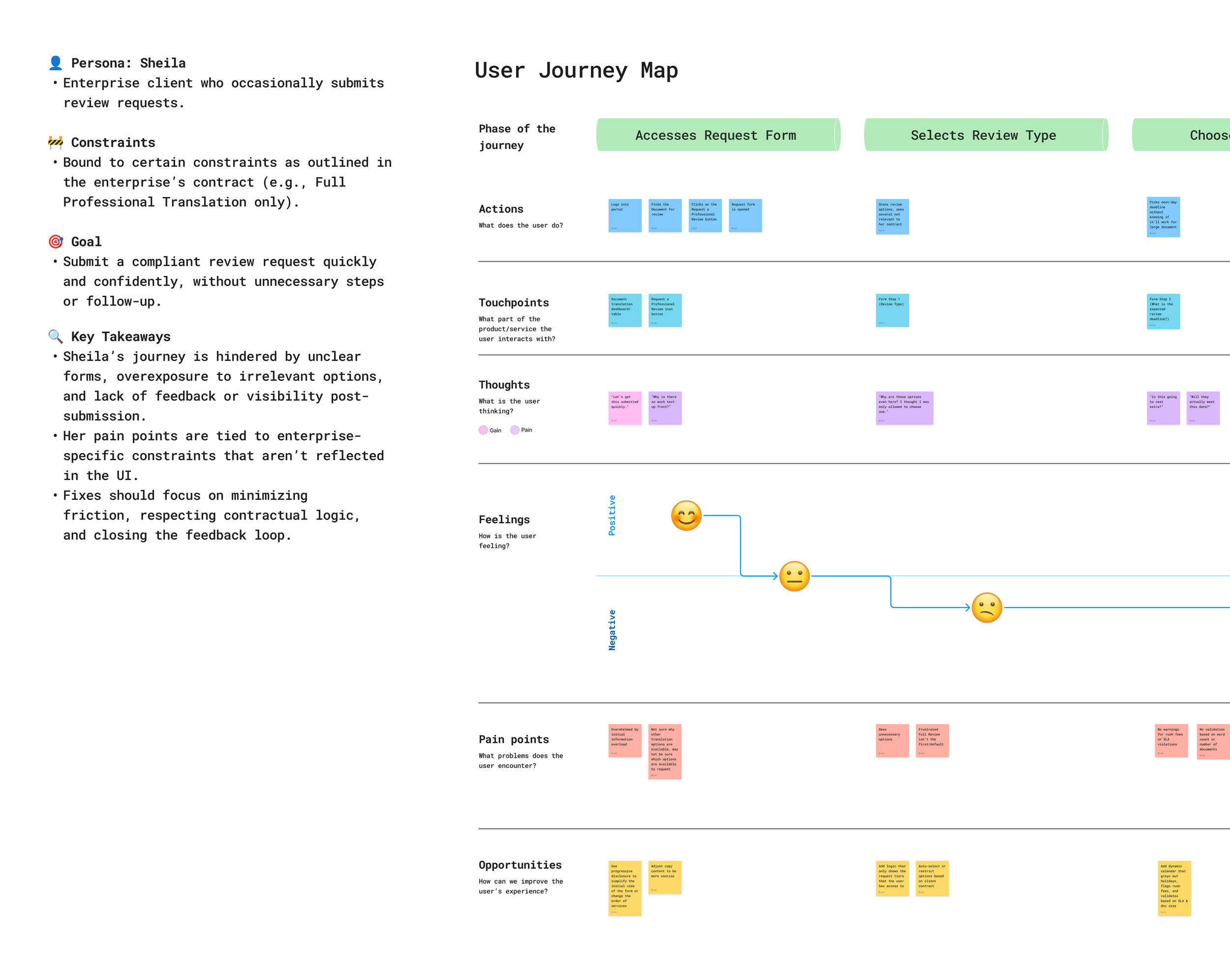
To close the gap, I interviewed a frequent client user of RaPR.
💬 They shared:
Uncertainty around why some fields were required
Some fields felt irrelevant, as information was already defined in their contracts with Alexa
Confusing wording that lacked clear guidance
Overall, the form felt like an added burden rather than support
Mapping their journey revealed where confusion and frustration peaked, showing that clearer guidance and simpler structure could make the process smoother.
Competitive Analysis
I noticed detailed review-request workflows weren’t common in translation tools, so I also looked at workflows of related platforms.
📌 Key finding: The most effective workflows were simple and guided — fewer required fields, clear wording, and guidance baked in.
From Insights to Ideation
With the findings, I outlined actionable design recommendations, then presented to the design team to prioritize what could be explored now versus what should be backlogged.
🧭 I explored two design directions:
Future Vision: A smart form with auto-expanding/collapsing accordions and AI-assisted metadata to reduce manual entry.
MVP Direction: A simplified form that stayed close to the existing workflow ensuring feasibility and faster adoption.
Wireframe & Hi-Fi Designs
🚀 For the MVP design, I focused on:
Simplifying copy for clarity
Adding inline guidance where confusion had been reported
Adding some fields where the data could be autofilled
While the long-term vision included AI automatically pulling more context and metadata to reduce client effort, those capabilities were still being tested.
To keep momentum and feasibility, I designed an MVP that could streamline the workflow with resources confirmed by product management at the time.
Design Critique & Iteration
I was still able to demonstrate potential design directions by utilizing AI-assisted prototyping (Figma Make and Lovable) to quickly explore alternative concepts and communicate the potential directions with the team without investing time in creating the full designs.
With the feedback from the design crit, I iterated on my designs to create an interactive prototype to test with users.
Usability Testing
Through collaboration with the Linguistics and CS teams, I was able to test with eight internal and external users.
🎯 The goals of testing were to:
Identify confusing terminology, labels, or interaction
Assess user understanding of how their input will impact the review process
Validate usefulness of helper text and revised copy
Observe user response to form navigation
📌 Key Findings:
Navigation & Layout: Participants often clicked directly on section headers/accordions instead of using the “Next” button, suggesting the navigation pattern felt unintuitive.
Discoverability Issues: The icon to access the request form was difficult to locate when visible on hover or hidden in the kebab icon menu. Some accordion content was also overlooked.
Field Placement: Several participants expected to find the “Audience” field in different sections, leading to misclicks and highlighting a mismatch between labels and user expectations.
Clarity & Copy: Inline helper text was considered useful, but some terms (e.g., “Translation” in service tiers) raised questions about accuracy.
👉 Where the Testing Led Us
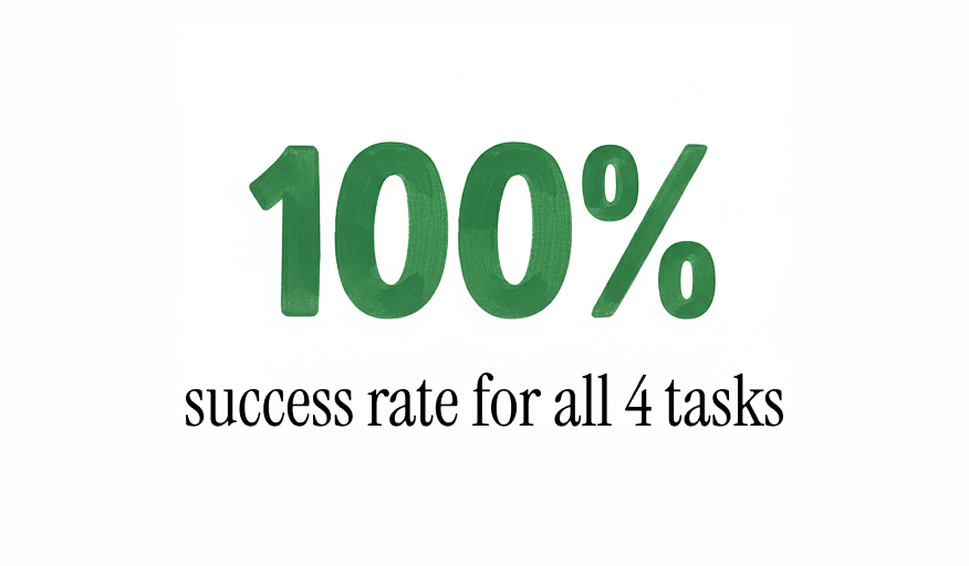
While internal users could successfully complete all tasks, misclick patterns and overlooked content suggested opportunities to simplify the form and better align it with client needs.
Further validation with client users will be critical to ensure the workflow balances through data collection with a smoother client experience.
The results of the usability tests set the stage for the team to build on the findings for future testing and exploration of the feature in upcoming phases.
Polished Explorations
Selecting an Intended Audience
⚠️ Pain Point
The original used an open-ended field, leaving clients unsure what to enter and resulting in inconsistent responses that required follow-up clarification from the Linguistics project managers.
✅ Solution
Refined the question wording and added a dropdown with 4-5 audience categories to guide input and reduce ambiguity. Next iteration should validate category options.
Indicating a Specific Page for Review
⚠️ Pain Point
The field had vague wording, leaving clients unsure what to input.
✅ Solution
Added inline helper text with examples of appropriate responses and optimized the question wording to make responses clear and actionable.
Added: “Review & Submit” Step
⚠️ Pain Point
Client feedback indicated a lack of confidence, and sometimes forgetting the details of their request until they received a summary and confirmation email from the project manager.
✅ Solution
Added a “Review & Submit” step displaying a summary of request selections. Users can click any item to jump directly to the corresponding steps for edits.
Impact & Learnings
🧩 Design Impact
During my time at Alexa Translations, engineering resources were carefully prioritized, which resulted in some design initiatives being deferred to later quarters. Unfortunately, this included the projects I contributed to.
Even though the work did not reach handoff, it positioned the team for smoother delivery by:
Bringing client voices into the development of this feature, balancing internal and external needs
Strengthening design documentation, ensuring problems were well-defined, validated, and ready for the design team to pick up where I left off once development capacity opened up
Establishing baseline usability test results and accelerating validation for future iterations
📊 Suggested KPIs
Form Completion Rate (% started vs. submitted)
Quote Request Volume (number of requests submitted via platform)
Client retention / Repeat Usage Rate (% of clients returning to submit additional requests)
📌 Takeaways
🤝 Regular stakeholder alignment helps maintain momentum, even when release timelines shift.
⚖️ Balancing multiple users perspectives helps prevent one group’s efficiency from becoming another’s pain point
🚀 Sometimes the best path forward is an MVP, while keeping room for innovation in the backlog
🔎 Upstream design explorations ensure problems are well-defined and ready when engineering resources allow
🚧 It’s okay to realize a problem may not be worth solving at a given time, or may need to be redefined — catching this early can save time and effort


